Scoring genre clarity...

Splatchinko capsule

Splatchinko

A Pachinko Rogue Like – Launch your Eyes at neurotic planets while chasing your eternal love. Unlock ridiculous mutations, build disastrously wrong combos, and if you have to blow up a few galaxies to reach her… well, that’s love. Right!?

DeckbuildingRoguelitePinball
Stupidi Pixel2026

Splatchinko scores 72/100 — better than 36% of Deckbuilding capsules (n=951).

Released 2026 · By Stupidi Pixel

Quick text summary

Splatchinko scored 72/100 on Steam Analyzer — Good for a Deckbuilding capsule. Top priority fix: [genre_clarity] Incorporate a visual Pachinko ball or launcher element to hint at core mechanic and differentiate from generic space games.

Capsule scores by dimension

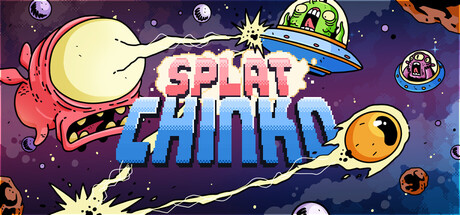
  • Genre Clarity: 7/10 — Quirky casual indie vibe clear. The whimsical space-themed artwork with planets, UFOs, and cartoon creatures signals a lighthearted indie game immediately. At tiny size, the colorful celestial elements and playful aesthetic remain recognizable, though the specific Pachinko mechanic is not visually obvious from the capsule alone. The genre reads as casual and colorful rather than mechanically specific.
  • Title Readability: 8/10 — Bold title reads well at scale. SPLATCHINKO uses a thick, high-contrast magenta and blue layered logo positioned prominently in the center-right, with strong outline definition against the starfield background. At small and tiny sizes, the title remains legible due to thick letterforms and color separation, though fine details of the outline become less crisp below small size. The bright colors and size ensure quick recognition during scroll.
  • Contrast & Color: 8/10 — Strong saturation and value contrast. Vibrant magentas, oranges, yellows, and bright greens pop distinctly against the deep purple night sky background, creating strong visual separation. The moon, planets, UFO, and title all have clear silhouettes and bright highlights that stand out in grayscale testing. The palette avoids muddy mid-tones and maintains energy even at tiny thumbnail size.
  • Uniqueness & Polish: 7/10 — Charming style, slightly generic space. The hand-drawn cartoon aesthetic with quirky creature design (the red angry face, the UFO characters) has personality and craft, suggesting a distinctive indie vision. However, space-themed casual games are common, and while the execution is clean, the core visual hook does not immediately communicate what makes Splatchinko mechanically unique. The art is polished but leans on familiar space-casual tropes.
  • Brand Consistency: 6/10 — Cohesive style, limited identity cues. The cartoon art style, color palette of purples, pinks, and yellows, and whimsical tone are internally consistent and likely match game UI and screenshots. However, there are no obvious iconic character, symbol, or motif that immediately screams Splatchinko—the design could fit several indie space games. The capsule establishes visual consistency but lacks a strongly memorable brand signature.
  • Composition: 7/10 — Balanced chaos with clear focal point. The title SPLATCHINKO sits as the primary focal point in the center-right with supporting space elements (moon, planets, UFO, creatures) distributed around it, creating visual interest without overwhelming. The composition uses depth layering with background stars, mid-ground planets, and foreground creatures, though elements are somewhat scattered. Safe margins appear respected, and the design holds together at small size, though the tiny thumbnail becomes busier and loses some clarity.

What works

  • High-contrast vibrant palette. Magentas, oranges, and yellows create strong separation from the dark purple background and remain vivid even at thumbnail sizes.
  • Legible, thick-outlined title. The SPLATCHINKO logo uses heavy strokes and bright color layering that survives scaling down to small and tiny viewports.
  • Whimsical, cohesive art style. Cartoon creatures and space elements share a consistent hand-drawn aesthetic that feels intentional and premium compared to generic space templates.

What hurts the capsule

  • No mechanical clarity. The capsule does not visually communicate the Pachinko or Rogue-Like core gameplay—it reads as generic space-casual without mechanic hints.
  • Generic space theme. While executed well, planets, UFOs, and space settings are common in indie casual games, limiting uniqueness and memorable brand distinction.
  • Scattered composition at tiny size. At thumbnail scale, the distributed elements (moon top-left, planets scattered, creatures on edges) create visual busyness that dilutes focal impact.

Priority fixes

  1. [genre_clarity] Incorporate a visual Pachinko ball or launcher element to hint at core mechanic and differentiate from generic space games.
  2. [uniqueness_polish] Introduce an iconic character or symbol (e.g., the protagonist 'eyes' mentioned in description) as a recognizable brand anchor on the capsule.
  3. [composition] Tighten element spacing and reduce edge-hugging creatures to improve clarity at thumbnail scale without losing visual charm.

Store copy priority fixes

  1. [feature_communication] Expand the 'Collect and upgrade your EYES' section to briefly explain how mutations combine with eye abilities to create synergies—this is core to the deckbuilding appeal and should be more explicit.
  2. [feature_communication] Add a sentence describing what 'third-contact encounters' are and why they matter mechanically, or replace the phrase with something more evocative and clear.
  3. [audience_targeting] Add a subtle line indicating whether runs are quick (15–30 minutes) or longer (45+ minutes) to help players assess time investment expectations.

Related guides

Steam app ID: 3802500 · Tags: Deckbuilding, Roguelite, Pinball, Turn-Based Tactics, Turn-Based Strategy