Scoring genre clarity...

Scary Game capsule

Scary Game

You open your eyes in a dark, unfamiliar room; each door drags you into a new chamber filled with absurd surprises and dark comedy. Will you manage to escape, or will you continue to star in this black comedy?

Free to PlayVery Positive(204)
Dark ComedySingleplayerHorror
KanGamesJul 4, 2025

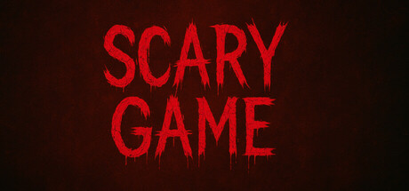
Scary Game scores 67/100 — better than 19% of Dark Comedy capsules (n=255).

Very Positive (204 reviews) · Free to Play · Released Jul 4, 2025 · By KanGames

Quick text summary

Scary Game scored 67/100 on Steam Analyzer — Solid for a Dark Comedy capsule. Top priority fix: [uniqueness_polish] Introduce a distinctive visual element—a character silhouette, environment hint (e.g., a door, absurdist object), or surreal symbol—that hints at the comedic escape-room gameplay and differentiates it from generic horror.

Capsule scores by dimension

  • Genre Clarity: 7/10 — Horror tone clear, genre ambiguous. The bold red 'SCARY GAME' text on dark background immediately signals horror or dark comedy themes. However, the game is actually an adventure/puzzle escape room hybrid with absurdist humor, which is not visually communicated at any size. At TINY size, only the word 'SCARY' registers, which could mislead toward pure horror rather than the comedic escape room gameplay the description indicates.
  • Title Readability: 9/10 — Excellent legibility across all sizes. The title uses large, high-contrast red sans-serif letters on a dark crimson-black gradient background with clear separation. The two-line stacked layout is highly readable at FULL, SMALL, and TINY sizes, with no loss of clarity when scaled. The bold weight and bright red value ensure the text remains distinct even under quick-scroll conditions or at thumbnail size.
  • Contrast & Color: 8/10 — Strong value separation, cohesive tone. The bright red title pops clearly against the dark background, creating excellent luminance contrast that passes grayscale testing with clear silhouette separation. The gradient background subtly darkens from brownish-red to near-black, which supports the horror aesthetic while keeping the foreground text dominant. At TINY size, the red remains vibrant and readable, though the background gradient loses nuance.
  • Uniqueness & Polish: 5/10 — Minimal but generic horror approach. The design relies entirely on a simple color contrast strategy with no visual storytelling, character, environment hint, or mechanic indication beyond the word 'SCARY.' Compared to top-performing indie capsules like DREDGE, Slay the Princess, or COCOON, which use distinctive art, atmosphere, or iconic visuals, this feels template-like—a plain text splash on a dark gradient. The execution is clean, but there is no distinctive hook that signals the absurdist dark comedy or puzzle-escape gameplay described.
  • Brand Consistency: 4/10 — No memorable identity or visual anchor. The capsule contains no recurring visual motif, character, symbol, palette cue, or art style that would make it recognizable in future marketing. Without reference to the 5 store screenshots, there is nothing here that suggests a specific game identity or brand beyond generic horror branding. A player who saw this thumbnail and the game's actual trailer or screenshots would struggle to connect them visually.
  • Composition: 7/10 — Centered, clear hierarchy, lacks depth. The two-line title is centered vertically and horizontally, creating clear visual hierarchy and safe margins that survive Steam cropping. The stacked layout avoids edge hugging and works well at all sizes. However, the composition is flat and static—there is no layered depth, no foreground element, no environmental context, or secondary focal point to create visual interest beyond the text itself.

What works

  • Exceptional title legibility. Bold red sans-serif on dark background reads perfectly at FULL, SMALL, and TINY sizes with zero decay in clarity or scannability.
  • Strong color contrast and pop. High-value red silhouette against dark crimson-black gradient ensures the capsule stands out in Steam browsing, passing grayscale contrast testing.
  • Safe composition and margins. Centered stacked layout avoids edge clipping and maintains legibility across Steam crop variations without awkward gaps or misalignment.

What hurts the capsule

  • Misleading genre signaling. The 'SCARY GAME' framing signals pure horror when the actual game is an absurdist adventure-escape hybrid with dark comedy—a significant tonal mismatch.
  • No visual storytelling or hook. The capsule is pure typography with zero environment hint, character, mechanic cue, or visual context—it could describe any horror game and lacks personality.
  • Zero brand identity or memorability. No iconic symbol, character, motif, or signature style appears; a player cannot recognize this game later from visual recall alone.
  • Static, flat composition. No layered depth, environmental atmosphere, or secondary focal point beyond centered text creates a template-like, uninspired visual experience.

Priority fixes

  1. [uniqueness_polish] Introduce a distinctive visual element—a character silhouette, environment hint (e.g., a door, absurdist object), or surreal symbol—that hints at the comedic escape-room gameplay and differentiates it from generic horror.
  2. [genre_clarity] Add a subtle visual cue or secondary element that signals dark comedy or puzzle-adventure tone (e.g., a distorted door frame, confused expression, or surreal environment detail) to correct the misleading 'pure horror' inference.
  3. [brand_consistency] Develop a recognizable art style, color accent, or motif (beyond red text) that appears consistently across store assets and future marketing to build brand recall.
  4. [composition] Layer depth by introducing a foreground element (character or object) and background environment context to break the static text-only layout and create visual interest at all sizes.

Store copy priority fixes

  1. [uniqueness] Add 1–2 concrete examples of absurd room scenarios or comedic horror moments (e.g., 'a kitchen where the appliances behave inexplicably' or 'a bathroom with an unexpected occupant') to differentiate from generic dark comedy walking sims.
  2. [feature_communication] Expand the 'Environmental Storytelling' bullet with a brief specific example of how wall writings or objects create dark comedy, not just atmosphere.
  3. [audience_targeting] Add a sentence clarifying the intended experience moment (e.g., 'perfect for a single sitting during a break' or 'designed for players who love absurdist humor over jump-scare intensity') to narrow audience expectation further.

Related guides

Steam app ID: 3809870 · Tags: Dark Comedy, Singleplayer, Horror, Funny, Comedy