This Is Why We Don't Play Golf scores 63/100 — better than 5% of Perma Death capsules (n=599).

Quick text summary

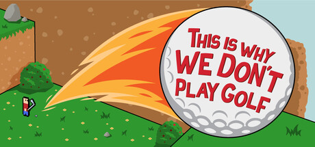
This Is Why We Don't Play Golf scored 63/100 on Steam Analyzer — Solid for a Perma Death capsule. Top priority fix: [title_readability] Move the title text outside the golf ball or significantly increase font size and weight so it remains legible at 120x45px thumbnail scale without requiring squinting.

Capsule scores by dimension

  • Genre Clarity: 7/10 — Clear comedic physics game vibe. The capsule immediately signals a lighthearted, absurdist take on golf through the oversized golf ball with comedic text and the tiny character on a chaotic hillside. At tiny size, the golf ball silhouette and small figure climbing a slope clearly read as physics-based platformer gameplay rather than simulation golf. The exaggerated scale relationship and green terrain hierarchy communicate casual indie action, though the connection to 'co-op' is not visually evident.
  • Title Readability: 5/10 — Text readable at full, fails tiny. At full header size, the red text 'THIS IS WHY WE DON'T PLAY GOLF' inside the golf ball is clearly legible with good contrast against white. However, at tiny thumbnail size (120x45), the text becomes illegible—the text density and small letterforms collapse into unreadable noise, and the viewer cannot parse the specific message without squinting. The title placement inside the ball graphic, while clever thematically, sacrifices readability at Steam's actual thumbnail preview sizes.
  • Contrast & Color: 7/10 — Strong warm tones, good separation. The warm orange-to-yellow gradient on the golf ball and background hills provides excellent value contrast against the Steam dark background (#1b2838) and reads instantly in grayscale. The green grass, brown terrain, and bright ball all have distinct value separation creating clear silhouettes. At tiny size, the warm ball pops cleanly, though fine texture detail in the grass is lost and the small character silhouette becomes difficult to distinguish.
  • Uniqueness & Polish: 6/10 — Charming concept, generic execution. The core joke—a golf ball with comedic text and chaotic mountain setting—is conceptually distinctive and fits the game's absurdist identity. However, the illustration style is competent cartoon art without a signature visual hook or premium finish that would elevate it above mid-tier indie work. The simplistic flat color palette and standard digital painting approach feel functional but not particularly memorable or craft-forward compared to standout indie capsules like DAVE THE DIVER or Viewfinder.
  • Brand Consistency: 6/10 — Thematic alignment, limited identity. The capsule commits fully to the comedic golf theme with consistent visual language (golf ball, mountain, tiny figure), which aligns well with the game's stated concept of 'chaotic co-op physics platformer.' Without access to the 12 store screenshots, internal consistency appears solid in isolation, but the visual identity lacks a distinctive motif, character, or signature color palette that would make this capsule instantly recognizable as a returning franchise or iconic indie title.
  • Composition: 7/10 — Clear focal point, solid hierarchy. The large golf ball anchors the composition as the dominant element with the tiny climber on the hill providing scale contrast and visual interest. Background mountains and green grass create basic depth layering. The title placement inside the ball is thematically clever but at tiny size creates visual competition; the ball remains the clear focal point even when text becomes illegible, which actually helps readability at very small sizes despite the text legibility failure.

What works

  • Strong focal point hierarchy. The oversized golf ball dominates the composition and immediately reads as the primary subject even at tiny sizes, creating instant visual clarity.
  • Warm color contrast against dark background. The orange-yellow ball and green-brown terrain create excellent value separation from the Steam dark background, ensuring the capsule pops in browsing.
  • Thematic coherence with game concept. The visual elements (ball, mountain climber, chaos) directly communicate the absurdist physics platformer premise without confusion.

What hurts the capsule

  • Title text illegible at tiny size. The red text inside the golf ball becomes unreadable at thumbnail scale, undermining the comedic hook and making the capsule harder to identify in quick scrolling.
  • Generic illustration polish. The art style lacks distinctive craft or signature visual hooks compared to standout indie releases; it reads as competent but forgettable.
  • No co-op or multiplayer visual cues. The single tiny character does not communicate that this is a co-op game, missing an opportunity to highlight a unique selling point.

Priority fixes

  1. [title_readability] Move the title text outside the golf ball or significantly increase font size and weight so it remains legible at 120x45px thumbnail scale without requiring squinting.
  2. [genre_clarity] Add a second character or co-op visual indicator (paired figure, split-screen effect, or interaction hint) to better communicate multiplayer as a core feature.
  3. [uniqueness_polish] Refine the illustration with more distinctive linework, shading depth, or stylistic signature that elevates it beyond generic cartoon execution.

Store copy priority fixes

  1. [feature_communication] Add 2-3 specific hazard examples in the detailed description (e.g., 'spin traps that reverse ball momentum, invisible platforms, or wind gusts') to clarify what players will encounter and why falling is mechanically engaging.
  2. [genre_clarity] Explicitly mention the permadeath mechanic and its impact on gameplay (e.g., 'Each fall costs you progress—plan your swings carefully or restart the climb') to set expectations and differentiate the difficulty/roguelike element.
  3. [feature_communication] Restructure the feature list as proper bullet points with action verbs (e.g., '• Swing across 5 unique mountain regions—each with escalating physics chaos' instead of buried prose) to improve scannability.
  4. [audience_targeting] Add a line explicitly addressing solo players (e.g., 'Conquer the mountain alone for pure platformer mastery, or rope in a friend for hilarious co-op chaos') to clarify that solo is a valid, complete experience rather than a consolation.

Related guides

Steam app ID: 3811890 · Tags: Perma Death, Mini Golf, Adventure, Difficult, Casual