Scoring genre clarity...
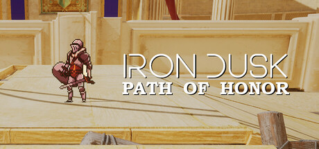
A 2D/3D hybrid medieval action-adventure game where you fight, block, and outwit enemies in real-time combat while navigating arenas, pirate towns, and cult strongholds on a quest to reclaim your honor.
Free to Play4 user reviews
ActionAdventureAction-Adventure
Studio 70Sep 9, 2025