Scoring genre clarity...
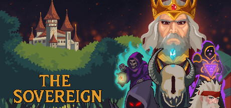
A tactical roguelike RPG where you face fragments of an immortal king’s soul in high-stakes turn-based battles. Every decision you make directly impacts your future, with bosses reacting in real-time to your choices and playstyle. Learn their preferences as well as their triggers to survive.
$9.991 user reviews
StrategyRPGTurn-Based Strategy
ResenhaDoBarOct 14, 2025