Scoring genre clarity...
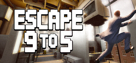
A hardcore climbing parkour game that challenges you to break free from the monotony of office life. Start in the office cubicles and ascend toward the limitless skies above. As you climb higher the final heights will test not just your skill, but your patience too.
HK$ 39.00Positive(10)
CasualAdventureSimulation
Room Zero Studios19 Nov, 2025