Scoring genre clarity...
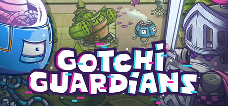
Adapt, strategize, and dominate your rivals in this multiplayer roguelite tower defense brawler. Upgrade towers, wield powerful items, and outlast the madness to become the last Guardian standing!
Free to PlayPositive(48)
ManagementMilitaryBase Building
Pixelcraft StudiosJul 30, 2025