Scoring genre clarity...

Pull the Beer capsule

Pull the Beer

A hardcore co-op adventure about delivering the beer. Pull a heavy but fragile barrel with ropes through levels full of danger, and don't let that legendary brew spill along the way.

Co-opAdventurePhysics
BroNickDoneTo be announced

Pull the Beer scores 78/100 — better than 79% of Co-op capsules (n=1,694).

Released To be announced · By BroNickDone

Quick text summary

Pull the Beer scored 78/100 on Steam Analyzer — Good for a Co-op capsule. Top priority fix: [uniqueness_polish] Add a more distinctive environmental or atmospheric detail to the desert setting that signals the core mechanic (e.g., hazards, broken barrels, or terrain challenge hints) to increase visual storytelling and stand out against competitor capsules.

Capsule scores by dimension

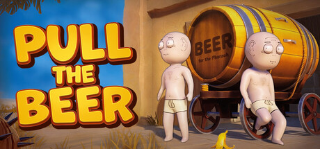
  • Genre Clarity: 8/10 — Desert co-op adventure clearly communicated. The capsule immediately signals a casual, whimsical co-op game through two cartoon characters pulling a large beer barrel across a sandy desert with pyramids and palm trees. At tiny size, the barrel-pulling mechanic and two-character setup remain readable, successfully conveying cooperative gameplay and the core hook of barrel transport without ambiguity.
  • Title Readability: 9/10 — Bold white title dominates legibly. The title 'PULL THE BEER' uses thick, bold white letters with a bright yellow splash effect behind it, positioned at the top center over clear sky. The letterforms maintain excellent clarity at full, small, and tiny sizes due to strong outline contrast and generous letter spacing; the tagline does not interfere with recognition at any scale.
  • Contrast & Color: 8/10 — Warm palette pops against dark Steam. The bright blue sky, warm sandy beige tones, and brown barrel create strong value separation against the dark Steam background #1b2838. The yellow splash behind the title and the two light-skinned characters pop clearly in silhouette; the overall warm-to-cool contrast is intentional and effective even under grayscale conversion, with the barrel and characters remaining distinct focal points.
  • Uniqueness & Polish: 7/10 — Charming cartoon style with clear appeal. The art style is clean, colorful, and deliberately cartoonish with a mid-century illustration aesthetic that feels intentional rather than generic. The whimsical tone, character design, and the central barrel-pulling mechanic communicate a unique selling point (co-op physics puzzle delivery), though the desert setting is a familiar trope that slightly reduces distinctiveness compared to top-tier capsules.
  • Brand Consistency: 7/10 — Cohesive cartoon world with visual identity. The capsule presents a unified art direction: consistent character design, cohesive color palette (warm desert tones, clear sky blue), and a recognizable cartoon illustration style that aligns well with casual indie gaming brands. The barrel as a visual motif and the two-character pairing establish identity cues, though without reference to the 10 store screenshots, internal consistency appears solid but not yet iconic.
  • Composition: 8/10 — Balanced layout with clear focal hierarchy. The title anchors the top with the barrel and characters positioned in the center-bottom third, creating a stable composition with the pyramid and palm tree framing edges without crowding. At small and tiny sizes, the barrel remains the primary focal point, the two characters read as a supporting secondary element, and the sky background provides breathing room; safe margins are respected and nothing critical sits at dangerous crop edges.

What works

  • Title legibility at all scales. Bold white letters with yellow splash achieve excellent readability from full size down to tiny thumbnail thanks to thick letterforms and high contrast.
  • Clear core mechanic communication. The barrel, ropes, and two-character setup immediately signal co-op cooperative gameplay and the pulling-transport loop at a glance.
  • Warm color contrast against Steam background. Desert palette with bright sky blue separates cleanly from #1b2838, making the entire scene visually pop in quick-scroll conditions.
  • Intentional cartoon art direction. Cohesive illustration style and character design create a polished, premium indie feel rather than a generic template.

What hurts the capsule

  • Desert setting lacks distinctiveness. Pyramids and palm trees are familiar visual tropes in casual games, reducing memorable uniqueness compared to top-performing capsules.
  • Limited environmental detail complexity. The simple, flat background lacks layering depth or secondary visual interest that might enhance brand recognition on repeat viewing.

Priority fixes

  1. [uniqueness_polish] Add a more distinctive environmental or atmospheric detail to the desert setting that signals the core mechanic (e.g., hazards, broken barrels, or terrain challenge hints) to increase visual storytelling and stand out against competitor capsules.
  2. [brand_consistency] Ensure the barrel design, character proportions, and color palette are consistently applied across all 10 store screenshots to build a stronger, more recognizable identity cue for repeat players.

Store copy priority fixes

  1. [feature_communication] Expand the FEATURES section to include concrete mechanics: e.g., 'Physics-driven barrel handling,' 'Dynamic weather and terrain hazards,' 'Local and online co-op,' 'Single-player challenge mode' to give players a clearer feature checklist.
  2. [audience_targeting] Add a sentence addressing solo players: 'Play alone to master the barrel's physics, or team up online for chaotic co-op fun' to legitimize and highlight both modes equally.
  3. [uniqueness] Insert a differentiator statement early in the detailed description, such as 'The only co-op physics platformer where the cargo is as challenging as the terrain' or highlight a unique mechanic not standard in the genre.

Related guides

Steam app ID: 3819370 · Tags: Co-op, Adventure, Physics, Multiplayer, Online Co-Op