Scoring genre clarity...
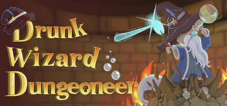
Unleash wild magic as a high-functioning, potion-loving wizard blasting your way through the ever-shifting dungeons. Balance the buzz- one too many and your magic fails, too few and chaos reigns. Master your Blood Potion Concentration, survive the hangover, and embrace the madness!
$7.99Positive(14)
Action RoguelikeDungeon CrawlerRoguelite
FyreFlight GamesOct 21, 2025