Scoring genre clarity...

GunflareEpoch capsule

GunflareEpoch

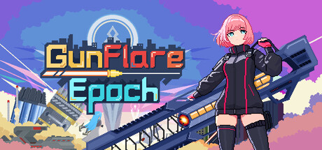
"Gunflare Epoch" is a roguelike top-down shooter. Earth has fallen. As rebel rangers—humanity's last hope—plunge into randomized dungeons, arm yourself,and survive endless hordes. Uncover the rebellion's truth in a storm of bullets and scrap.

$6.998 user reviews
Bullet HellAction RoguelikePixel Graphics
FatBird GameJan 28, 2026

GunflareEpoch scores 78/100 — better than 83% of Bullet Hell capsules (n=1,285).

8 user reviews · $6.99 · Released Jan 28, 2026 · By FatBird Game

Quick text summary

GunflareEpoch scored 78/100 on Steam Analyzer — Good for a Bullet Hell capsule. Top priority fix: [genre_clarity] Add subtle visual cues like loot drop particles, roguelike UI elements, or dungeon floor tiles to communicate procedural/roguelike gameplay alongside action.

Capsule scores by dimension

  • Genre Clarity: 8/10 — Action shooter identity clear. The character holds a large weapon and stands in a combat-ready pose against a cyberpunk cityscape, immediately signaling action gameplay. The anime-styled female character, neon color palette, and industrial setting reinforce modern action game expectations. At tiny size, the weapon silhouette and posed character still read as an action-oriented title, though specific roguelike mechanics are not visually apparent.
  • Title Readability: 9/10 — Bold, layered, legible throughout. The title 'GunFlare Epoch' uses a thick golden/yellow sans-serif font with a contrasting cyan 'Epoch' subtitle, creating strong visual hierarchy and color separation. Both words remain crisp and readable at small and tiny sizes due to weight, outline, and placement on a controlled background region with the character and buildings behind. The clean letterforms and strategic spacing ensure zero legibility collapse across all viewing conditions.
  • Contrast & Color: 8/10 — Vibrant neon pop with good separation. Bright cyan, magenta, and golden yellows create strong value and hue separation against the purple-blue background gradient and Steam's dark interface. The character's pink hair and black outfit silhouette clearly from the cityscape midground, and neon glow effects enhance perceived contrast. At tiny size, the warm title text and cool character/sky still read distinctly without blending into the background.
  • Uniqueness & Polish: 7/10 — Polished anime aesthetics, slight generic. The execution is clean with intentional neon-noir visual direction, anime character design, and strategic glow effects that feel premium and cohesive. However, the anime girl with gun on cyberpunk cityscape is a familiar trope in indie action games, limiting standout distinctiveness compared to top-tier benchmarks. The craft quality is high but the core visual hook is not uniquely memorable for the roguelike shooter subgenre.
  • Brand Consistency: 7/10 — Consistent neon-noir identity present. The capsule establishes a recognizable visual identity through anime character design, neon color palette (cyan, magenta, gold), and cyberpunk setting that should carry to gameplay and marketing assets. The geometric, clean design language and consistent lighting model suggest internal cohesion. Without referencing the 10 store screenshots directly, the capsule presents a unified brand voice, though the identity is not as iconic or instantly recognizable as top AAA action titles.
  • Composition: 8/10 — Strong hierarchy, character focal point. The character occupies the right-center position as the primary focal point, with the cityscape and title supporting rather than competing for attention. Layered depth (distant city, mid-ground buildings, foreground character) creates clear spatial hierarchy and visual flow. Title placement on the left avoids edge hugging, and the composition remains balanced and readable at all sizes; at tiny size, the character and title still anchor the frame without clutter or dead zones.

What works

  • Title contrast and legibility. Golden and cyan text layers stand out sharply against the background across all sizes, ensuring the game name is instantly readable even at tiny thumbnail dimensions.
  • Clear action genre signaling. Weapon-holding pose, combat stance, and neon-noir cyberpunk setting immediately communicate action gameplay without ambiguity.
  • Layered composition depth. Distinct foreground character, midground architecture, and background sky create visual separation that prevents muddiness and maintains readability at small sizes.
  • Cohesive color and aesthetic direction. Neon palette and anime art style feel intentional and unified, establishing a recognizable visual brand identity across the capsule.

What hurts the capsule

  • Generic anime + cyberpunk trope. While executed well, the anime girl with gun on dystopian cityscape is a familiar visual combination that lacks a distinctive hook to stand apart in a crowded indie action market.
  • Roguelike mechanics not visually evident. The capsule communicates action shooter but does not hint at roguelike randomization, progression, or procedural generation elements that are core to the game's identity.
  • Character visual cliché potential. Pink-haired anime girl in tactical black outfit is a well-worn character design archetype that may not feel fresh or surprising at quick glance.

Priority fixes

  1. [genre_clarity] Add subtle visual cues like loot drop particles, roguelike UI elements, or dungeon floor tiles to communicate procedural/roguelike gameplay alongside action.
  2. [uniqueness_polish] Introduce a distinctive visual motif or signature effect unique to Gunflare Epoch (e.g., weapon-specific energy particles, unique UI framing) to differentiate from generic anime action games.
  3. [brand_consistency] Ensure neon color palette (cyan, magenta, gold) and character silhouette are replicated consistently across all 10 store screenshots and key promotional assets for unified brand recognition.

Store copy priority fixes

  1. [feature_communication] Rewrite each system bullet with a concrete example or benefit. Example: 'Freely equip weapon attachments to alter weapon characteristics—swap a rifle barrel to switch from single-shot precision to rapid-fire spray, or add scopes to turn a shotgun into a long-range sniper tool.'
  2. [uniqueness] Add a 1–2 sentence statement of what makes GunFlare Epoch distinct from other roguelikes. Example: 'Unlike typical roguelikes, every weapon can be customized mid-run without resetting your build, letting you adapt to any challenge dynamically.'
  3. [audience_targeting] Insert a sentence signaling difficulty and intended audience early in the short description. Example: 'Perfect for players seeking a roguelike that rewards tactical weapon builds without demanding pixel-perfect reflexes.'
  4. [tone_match] Revise the detailed description's bullet points to echo the energetic, dramatic tone of the short description rather than corporate marketing voice.

Related guides

Steam app ID: 3829150 · Tags: Bullet Hell, Action Roguelike, Pixel Graphics, Roguelike, Top-Down Shooter