Scoring genre clarity...

Chrono Port : Heroes of All Time capsule

Chrono Port : Heroes of All Time

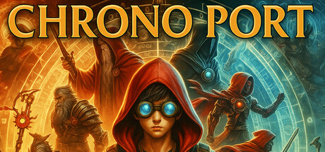
Travel through time, recruit legendary heroes, and battle an ancient evil in this strategic turn-based RPG. Explore 60 unique worlds, unlock 60 heroes, and face off against powerful villains in 3v3 combat. Customize your team and shape the fate of all timelines.

Free to Play5 user reviews
AdventureRPGStrategy
Enaayah Software Development and Services Private LimitedAug 16, 2025

Chrono Port : Heroes of All Time scores 72/100 — better than 48% of Adventure capsules (n=7,922).

5 user reviews · Free to Play · Released Aug 16, 2025 · By Enaayah Software Development and Services Private Limited

Quick text summary

Chrono Port : Heroes of All Time scored 72/100 on Steam Analyzer — Good for a Adventure capsule. Top priority fix: [uniqueness_polish] Introduce a distinctive visual signature—such as a unique time-fracture effect, iconic artifact, or signature pose—that differentiates the capsule from standard hero-recruitment games and creates a memorable brand anchor.

Capsule scores by dimension

  • Genre Clarity: 7/10 — Time-travel RPG with hero recruitment. The central hooded figure with glowing blue eyes and the split orange/blue color scheme clearly signal a sci-fi or time-manipulation theme, supported by the geometric patterns and energy effects. At tiny size, the composition still reads as a fantasy/sci-fi action game with multiple characters, though the specific 'turn-based strategic RPG' genre is not immediately obvious from visuals alone—it could pass for action-adventure. The hero silhouettes and dynamic pose convey combat focus effectively.
  • Title Readability: 8/10 — Bold gold title, clear at all sizes. CHRONO PORT is rendered in large, bold gold lettering with a solid drop shadow and geometric outline effects that maintain readability at full, small, and tiny sizes. The letterforms are clean and evenly spaced with strong contrast against both the orange and blue gradient backgrounds. At tiny size the title remains legible as a cohesive unit, though fine details like the geometric patterns blur slightly.
  • Contrast & Color: 8/10 — Strong warm-cool split, high saturation. The split composition creates excellent value separation with warm orange-gold tones on the left clashing against cool blue-cyan on the right, both highly saturated and reading distinctly at tiny sizes. The hooded central figure's glowing blue eyes and red cloak pop clearly against the gradient, and the grayscale test confirms strong silhouette separation throughout. The design avoids muddy mid-tones and maintains clean edges even at small scales.
  • Uniqueness & Polish: 7/10 — Polished time-travel motif, slightly generic. The hooded-protagonist-with-glowing-eyes and split color scheme create a cohesive time-travel aesthetic with intentional craft in the geometric energy patterns and lighting effects. However, the core visual formula—cloaked hero, glowing eyes, dynamic supporting characters—is familiar in indie RPG space and doesn't feel distinctly memorable compared to top benchmarks like Persona 3 Reload or Metaphor: ReFantazio. The execution is clean but the concept reads as competent rather than groundbreaking.
  • Brand Consistency: 6/10 — Consistent style, limited iconic anchor. The warm-cool gradient, geometric energy effects, and hooded-protagonist motif are consistently applied across the visible composition and likely carry through the game's visual language. However, there is no immediately distinctive symbol, character trait, or signature palette element that would be instantly recognizable without the title—the design is cohesive but relies heavily on the 'time-travel hero' archetype rather than a unique brand signal. The style is internally coherent but not distinctly ownable.
  • Composition: 7/10 — Clear focal point, balanced depth layers. The central hooded figure with glowing eyes anchors the composition as the primary subject, with supporting hero silhouettes framing left and right to create depth and guide the eye inward. The title sits confidently at the top in safe margins and does not compete with the focal point. At tiny size the layout remains legible with the central figure still reading as primary, though the supporting characters compress into the background effectively. Safe margins are respected and no critical elements appear to be edge-vulnerable to Steam cropping.

What works

  • Title legibility across scales. CHRONO PORT maintains clear readability and visual prominence at full, small, and tiny sizes thanks to bold letterforms, strong contrast, and strategic spacing against a controlled background region.
  • Color contrast and value separation. The warm orange-to-cool blue gradient split creates excellent silhouette clarity and pops strongly against the Steam dark background, with saturation and value range supporting discoverability at quick-scroll speeds.
  • Clear focal hierarchy. The hooded protagonist remains the dominant focal point at all viewing sizes, with supporting characters framing the composition and reinforcing depth without competing for attention.

What hurts the capsule

  • Generic hero-recruitment visual formula. The hooded-cloaked-protagonist-with-glowing-eyes concept is familiar in indie RPG space and lacks a distinctive visual hook that would differentiate it from similar games in the genre.
  • Limited brand identity anchor. No immediately recognizable symbol, signature character trait, or unique motif is visible that would make this capsule stand out on a second encounter or feel distinctly ownable as a brand asset.
  • Subgenre ambiguity at small size. While the action-adventure tone reads clearly, the 'turn-based strategic RPG' and 'time-travel' mechanics are implied through color palette rather than explicitly communicated through gameplay UI or iconic visual language.

Priority fixes

  1. [uniqueness_polish] Introduce a distinctive visual signature—such as a unique time-fracture effect, iconic artifact, or signature pose—that differentiates the capsule from standard hero-recruitment games and creates a memorable brand anchor.
  2. [genre_clarity] Consider adding subtle UI elements (turn-order indicator, strategy grid hint, or time-crystal motif) to reinforce the turn-based RPG identity without cluttering the composition.
  3. [brand_consistency] Establish and repeat a unique color accent or geometric motif across the full 60-hero roster and world designs to create a cohesive, recognizable visual identity that extends beyond this single capsule.

Store copy priority fixes

  1. [hook_strength] Rewrite the opening of the detailed description to lead with an emotional hook ('Save the world across every era of history') rather than restating the short description.
  2. [uniqueness] Add a paragraph explaining what makes this game's hero collection or combat system distinct—e.g., 'Unlike other hero collectors, Chrono Port lets you...' or 'The Chrono Port is the only mechanic that allows...'
  3. [tone_match] Consolidate the mechanical sections (HEROES AND VILLAINS, BATTLE DYNAMICS, CORE MECHANICS) into a more narrative tone that explains why each system matters to the player fantasy, not just what it does.
  4. [feature_communication] Add a brief 'Why Chrono Port' section highlighting 1–3 standout mechanics or moments that justify the 60 heroes and 30 villains—e.g., synergy combos, environmental boss mechanics, or hero relationships.

Related guides

Steam app ID: 3829720 · Tags: Adventure, RPG, Strategy, Action RPG, JRPG