Scoring genre clarity...
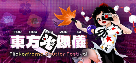
A fan-made celebration of Touhou's creative spirit! When a suspicious festival erupts, Aya must photograph spellcards, unlock skills, and uncover hidden truths. Packed with loving references to fanworks both old and new, from all around the world!
$14.99Positive(44)
Bullet HellShoot 'Em UpAction
Ryann ThierrySep 5, 2025