Hyper Chess scores 70/100 — better than 28% of Strategy capsules (n=5,103).

Quick text summary

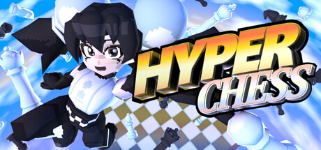
Hyper Chess scored 70/100 on Steam Analyzer — Good for a Strategy capsule. Top priority fix: [uniqueness_polish] Introduce a distinctive visual element—such as a glowing chess piece, real-time motion trails, or a split board/action effect—that visually communicates the 'hyper real-time' hook without relying on the title alone.

Capsule scores by dimension

  • Genre Clarity: 7/10 — Chess strategy with action energy. The checkerboard pattern in the background immediately signals chess, and the anime character in dynamic pose with energy effects conveys action and speed rather than turn-based gameplay. At tiny size, the board and character silhouette remain legible, though the action genre implication relies more on pose and effects than on UI or gameplay cues that would make 'real-time' obvious without description.
  • Title Readability: 8/10 — Bold, high-contrast logo placement. The title 'HYPER CHESS' uses thick golden-yellow lettering with a white outline, positioned in the right-center area against a clearer sky background rather than over busy elements. The word breaks read cleanly at small and tiny sizes due to the strong value separation, though at tiny size the outline adds critical legibility that prevents letterform collapse.
  • Contrast & Color: 8/10 — Vibrant character and warm title pop. The blue sky background, white cloud accents, and the character's black outfit with white/light detail create clear silhouette separation against the Steam dark background. The golden-yellow title with white stroke provides strong warm-to-cool contrast that stands out in quick scroll and maintains readability in grayscale due to high value difference.
  • Uniqueness & Polish: 6/10 — Anime style with generic execution. The anime character and dynamic pose give the capsule a stylized personality, but the design feels like a standard anime game capsule template—vibrant background, posed character, bold title overlay. The checkerboard pattern is thematic but familiar; there is no distinctive visual hook that communicates the core 'real-time chess' mechanic or differentiates this from other anime action titles beyond the title text itself.
  • Brand Consistency: 6/10 — Coherent anime aesthetic, limited identity. The character design, color palette (blue/orange/white), and anime render style are internally consistent and professional, suggesting good coordination across store assets. However, the visual identity relies heavily on a generic anime protagonist archetype; there are no signature motifs, icons, or memorable symbols that would establish a unique brand presence beyond the title wordmark.
  • Composition: 7/10 — Clear focal point with safe layout. The character occupies the left-center position as the primary focal point, with the title anchored to the right in a balanced layout that avoids edge cramping. The background uses depth layering—sky, clouds, board hints, and particle effects—but at tiny size the composition remains readable; however, the board pattern in the background adds visual noise that slightly competes with the character silhouette rather than reinforcing the chess theme.

What works

  • Strong title contrast and readability. Golden-yellow with white outline remains legible at all sizes and pops distinctly against the dark Steam background.
  • Clear character silhouette and focal hierarchy. The anime character's dark outfit and energetic pose command attention and guide the eye naturally without clutter.
  • Professional color cohesion. Blue, orange, and white palette is harmonious and conveys energy while maintaining visual polish.

What hurts the capsule

  • Generic anime capsule template feel. The design lacks a distinctive visual hook or unique selling point beyond the title; it reads as a standard anime action game rather than communicating 'real-time chess' innovation.
  • Checkerboard pattern adds subtle noise. While thematic, the board pattern in the background slightly competes with the character at small sizes and doesn't strongly reinforce the chess mechanic without text.
  • Limited brand identity signals. No iconic symbol, character motif, or signature visual element that would be recognizable across other promotional materials or store pages.

Priority fixes

  1. [uniqueness_polish] Introduce a distinctive visual element—such as a glowing chess piece, real-time motion trails, or a split board/action effect—that visually communicates the 'hyper real-time' hook without relying on the title alone.
  2. [genre_clarity] Add a subtle UI element or gameplay indicator (e.g., speed lines, multiple pieces in motion, or a timer visual) that makes the real-time action mechanic apparent at tiny size.
  3. [brand_consistency] Develop a signature character pose, icon, or palette accent that becomes a recognizable brand motif for repeat recognition.

Store copy priority fixes

  1. [feature_communication] Name and briefly describe at least 2-3 of the unique game modes (e.g., 'King Hunt, Timed Assault, Survival') to give players a concrete sense of variety and replayability.
  2. [audience_targeting] Add a single sentence clarifying whether the game supports solo play against AI or if it is multiplayer-only, to set expectations for different player types.
  3. [uniqueness] Strengthen the cosmetics selling point by explaining whether chess sets have mechanical differences or are purely visual, so the 'over a dozen sets' feels more significant.

Related guides

  • Steam page optimisationCapsule, copy, screenshots, tags — the full Steam page conversion stack.
  • Steam tags guideTag selection, ordering, and how it shapes Steam's recommendation rails.

Steam app ID: 3830210 · Tags: Strategy, Chess, Action, Board Game, Arcade