Scoring genre clarity...
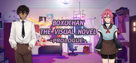
Follow Claire as she starts her own anime business called Boxuchan in this fully voice acted visual novel! Experience her first customer service moment as she handles it in a very sane and normal way!
$1.995 user reviews
AnimeSimulationVisual Novel
BoxuchanSep 1, 2025