Scoring genre clarity...
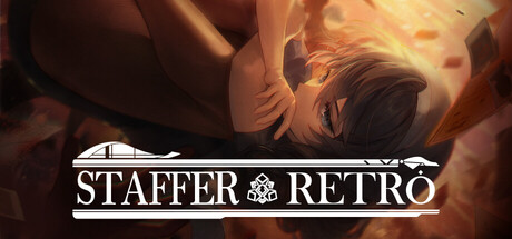
Staffer Retro : A Supernatural Mystery Quest capsule

Staffer Retro : A Supernatural Mystery Quest

Staffer Retro is a mystery adventure game where you uncover past incidents related to ‘Mana’, the source of supernatural powers. Gather information through dialogue and exploration, and piece together clues found in documents to guide the choices of Verita Retro, the protagonist.

DetectiveMysteryVisual Novel
Team TetrapodJul 22, 2026

Staffer Retro : A Supernatural Mystery Quest scores 70/100 — better than 36% of Detective capsules (n=627).

Released Jul 22, 2026 · By Team Tetrapod

Quick text summary

Staffer Retro : A Supernatural Mystery Quest scored 70/100 on Steam Analyzer — Good for a Detective capsule. Top priority fix: [uniqueness_polish] Integrate a distinctive visual element tied to 'Mana' or core mechanic—such as a unique glyph, documents, or character silhouette pose that hints at investigation gameplay and differentiates from generic mystery adventure templates.

Capsule scores by dimension

  • Genre Clarity: 7/10 — Mystery adventure with supernatural hints. The warm orange glow and ethereal character silhouette suggest supernatural or mystery elements, while the contemplative pose hints at narrative-driven gameplay rather than action. At tiny size, the atmospheric lighting reads as mysterious but genre clarity is slightly muddled—could suggest supernatural horror, adventure, or narrative mystery without stronger gameplay iconography. The overall mood effectively communicates 'mystery' but lacks specific genre visual anchors like documents, magnifying glass, or dialogue UI hints.
  • Title Readability: 8/10 — Clean white logo with strong contrast. The 'STAFFER RETRO' title uses clean white serif lettering with a subtle decorative bar and icon, positioned horizontally across the lower-middle of the capsule on a dark background. The contrast is excellent at all sizes, and letterforms remain legible down to tiny size. The compact, centered layout ensures the title stays visible and readable through Steam's standard cropping zones.
  • Contrast & Color: 8/10 — Strong warm-to-dark value separation. The warm orange and gold tones of the character and atmospheric effects create clear separation from the cool dark burgundy background, with high value contrast that reads well even at tiny size. The white title bar further reinforces hierarchy and silhouette clarity. In grayscale, the lighting still provides sufficient tonal separation to identify the character and title as primary focal points.
  • Uniqueness & Polish: 6/10 — Atmospheric but visually familiar approach. The ethereal character surrounded by warm magical light is well-executed but follows a common indie adventure visual template—similar atmospheric mystery vibes appear across multiple genre benchmarks like Chants of Sennaar and Slay the Princess. The craft is competent with smooth gradients and lighting, but the visual hook lacks a distinctive art style, iconic character design, or unique supernatural mechanic visualization that would elevate it beyond 'well-done standard.' The capsule does not communicate what makes Staffer Retro's mystery or Mana concept visually distinct.
  • Brand Consistency: 6/10 — Minimal identity cues, generic mystic theme. The warm, glowing aesthetic and serif typography are internally coherent, but there are no memorable iconic elements—no distinctive character silhouette, color palette, symbol, or visual motif that would make this recognizable as Staffer Retro on repeat viewing. The decorative icon above the title is subtle but not distinctive enough to serve as a brand anchor. Without access to comparing the 13 screenshots, the capsule does not establish a strong, unique visual identity that would stand out in memory or differentiate it from other mystery adventures.
  • Composition: 7/10 — Clear focal point with balanced layout. The character occupies the upper-center space with soft, glowing atmosphere creating depth and focus, while the title bar anchors the lower-middle without clashing. The composition is clean and reads well at small and tiny sizes with a clear primary subject and supporting typography. Safe margins appear respected, and the design should survive Steam's standard cropping; however, the upper-right and left edges fade softly with less intentional detail, creating minor dead zones that could be better utilized.

What works

  • Excellent title contrast and legibility. White serif lettering with subtle decorative elements maintains crisp readability from full size down to tiny thumbnail, ensuring discoverability in Steam lists.
  • Strong atmospheric mood and warm-dark contrast. The glowing character against burgundy-dark background creates visual separation and emotional intrigue that resonates with the mystery adventure genre.
  • Focused composition with clear hierarchy. Single character subject with supporting atmospheric effects and bottom-anchored title keeps attention organized and readable across all viewport sizes.

What hurts the capsule

  • Generic supernatural visual template. The ethereal glowing character design is competent but mirrors common indie adventure capsule approaches without distinctive art direction or Mana-specific visual identity.
  • Weak brand recognition signals. No iconic character, symbol, or unique palette element that would make this capsule recognizable as Staffer Retro on a second viewing or in a library.
  • Unclear gameplay hook or core mechanic. The capsule communicates 'mysterious and atmospheric' but does not visually hint at the dialogue-investigation-clue-piecing mechanics that define the experience.

Priority fixes

  1. [uniqueness_polish] Integrate a distinctive visual element tied to 'Mana' or core mechanic—such as a unique glyph, documents, or character silhouette pose that hints at investigation gameplay and differentiates from generic mystery adventure templates.
  2. [genre_clarity] Add subtle but readable UI hints (document stack, magnifying glass, dialogue bubble, or investigation tool) into the composition to strengthen mystery-adventure clarity at tiny size.
  3. [brand_consistency] Establish a recognizable color accent or symbol motif that appears consistently across capsule and in-game assets to build lasting brand identity for Staffer Retro.

Store copy priority fixes

  1. [hook_strength] Rewrite the opening line to lead with Verita's personal motivation: 'Verita Retro uncovers a dangerous truth about mana—and learns a secret that changes everything' rather than 'is a detective adventure that explores past events.'
  2. [uniqueness] Add 1-2 sentences explaining what sets this mystery apart: Is this a romance detective story? Do choices directly impact character fate? Is there a specific reason the supernatural powers matter to the protagonist emotionally?
  3. [audience_targeting] Include a clear signal about the intended player: 'For fans of branching narrative mysteries' or 'For players who enjoy logic puzzles with meaningful story consequences' to help the right audience self-identify.
  4. [feature_communication] Clarify the detective gameplay loop: Specify whether players solve puzzles directly, vote on deductions, or observe Verita deduce—the current copy is ambiguous about how much agency the player has.

Related guides

Steam app ID: 3837350 · Tags: Detective, Mystery, Visual Novel, 2D, Singleplayer