Scoring genre clarity...
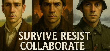
A fully narrated branching narrative game set in occupied Netherlands during World War 2. Every choice shapes the fate of a young Dutch civilian. Will you resist the Germans? Simply try to survive? Or join them in the fight against Bolshevism? Based on real events.
$5.992 user reviews
Choose Your Own AdventureInteractive FictionWorld War II
Asterism GamesSep 11, 2025