Scoring genre clarity...

AstroRage2049 capsule

AstroRage2049

A short space shooter game that you can finish in your break time with beginner-friendly gameplay and some special features.

$0.99Positive(11)
ActionArcadeShooter
CJJan 23, 2026

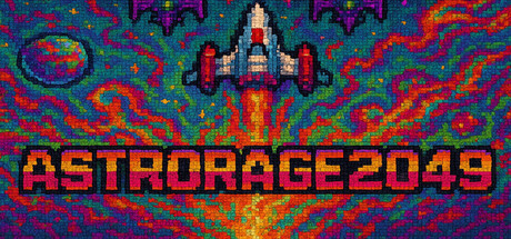
AstroRage2049 scores 83/100 — better than 96% of Action capsules (n=8,534).

Positive (11 reviews) · $0.99 · Released Jan 23, 2026 · By CJ

Quick text summary

AstroRage2049 scored 83/100 on Steam Analyzer — Good for a Action capsule. Top priority fix: [brand_consistency] Add a subtle signature element (iconic color accent, symbol, or ship detail variation) that could serve as a recognizable AstroRage2049 brand cue in future marketing.

Capsule scores by dimension

  • Genre Clarity: 9/10 — Classic arcade space shooter immediately clear. The pixel-art spaceship in the center, retro arcade aesthetic, vibrant sci-fi color palette, and explosive energy burst behind the craft instantly communicate a space shooter genre. At tiny size, the silhouette of the ascending ship and the radiating explosion lines remain unmistakable, clearly signaling arcade action gameplay without ambiguity.
  • Title Readability: 8/10 — Bold blocky text reads well at all sizes. ASTRORAGE2049 uses a strong pixelated font with clear letterforms positioned directly below the ship in the composition's lower third. The all-caps treatment and consistent stroke weight ensure legibility at small and tiny sizes, though the year suffix slightly compresses readability at the smallest viewing scale.
  • Contrast & Color: 9/10 — Saturated vibrant palette pops distinctly. Bright reds, oranges, yellows, and cyan blues create a high-saturation retro arcade palette that separates dramatically from Steam's dark background. The ship's white and red colors and the golden explosion burst maintain clear silhouette separation even in grayscale; the composition reads with excellent clarity during quick scroll.
  • Uniqueness & Polish: 8/10 — Polished retro aesthetic with coherent craft. The pixel art is clean and intentional, with consistent rendering throughout the ship, explosion effects, and background pattern noise. The design communicates a deliberate homage to classic arcade shooters with premium execution rather than generic asset reuse, and the wave-pattern background reinforces the sci-fi theme cohesively.
  • Brand Consistency: 7/10 — Retro arcade identity clear but generic motifs. The capsule establishes a strong retro space-shooter identity through pixel art, the centered spaceship icon, and arcade-game typography that align with genre expectations. However, the visual language relies heavily on arcade genre conventions rather than distinctive original brand markers that would make AstroRage2049 uniquely recognizable in subsequent marketing materials.
  • Composition: 9/10 — Excellent focal hierarchy and balanced layout. The ascending spaceship commands the center with a clear primary focal point, supported by layered explosion rays that create depth and guide attention upward. The title anchors the lower region with strong positioning, background pattern provides context without cluttering, and the composition maintains visual balance and clarity across full, small, and tiny viewing sizes without awkward edge cropping.

What works

  • Strong genre communication. Ship silhouette, explosion rays, and arcade aesthetic instantly signal space shooter action at any size.
  • Excellent contrast against dark background. Saturated reds, oranges, and yellows create vibrant separation that reads clearly during quick scroll.
  • Clean pixel-art execution. Consistent rendering, intentional effects, and coherent visual treatment convey premium indie craft.
  • Balanced composition hierarchy. Clear focal point (ship), supporting explosion effects, and anchored title prevent visual clutter or dead zones.

What hurts the capsule

  • Generic retro-arcade identity. While well-executed, the visual language relies on familiar space-shooter conventions without distinctive original brand markers.
  • Title year suffix loses clarity at tiny size. The '2049' becomes slightly compressed and harder to parse at smallest viewing scales due to numeric density.
  • Limited differentiation from genre peers. The capsule communicates competent arcade shooter but does not suggest gameplay hook, special feature, or unique selling point beyond genre expectation.

Priority fixes

  1. [brand_consistency] Add a subtle signature element (iconic color accent, symbol, or ship detail variation) that could serve as a recognizable AstroRage2049 brand cue in future marketing.
  2. [uniqueness_polish] Consider layering a UI hint or gameplay mechanic visual (e.g., power-up glow, score display, or wave indicator) to signal the 'quick play' and 'special feature' differentiators described.
  3. [title_readability] Increase spacing or letter-width of the '2049' suffix, or test repositioning it to a less visually dense area to improve clarity at tiny sizes.

Store copy priority fixes

  1. [hook_strength] Rewrite the protagonist paragraph to drop internet slang entirely and replace with a genuine hook like 'You're humanity's last pilot, tasked with taking down a rogue AI that has already destroyed entire colonies' to maintain tonal coherence.
  2. [uniqueness] Add a specific differentiator sentence after 'This is not a Survivor type of game' such as 'Combine puzzle-like patterns with arcade reflexes across hand-crafted boss encounters' to justify why this shmup stands apart.
  3. [tone_match] Remove the absurdist meme language and either commit to a single tone (comedic retro pastiche or serious sci-fi shooter) or clarify in the short description if humor is intentional.
  4. [feature_communication] Expand 'Basic Update System' and 'Psychedelic Visual' with one sentence each explaining what players will experience, e.g., 'Unlock new weapons and power-up combinations between runs' and 'Neon-saturated visuals and pulsing soundscapes inspired by 1980s arcade culture.'

Related guides

Steam app ID: 3841240 · Tags: Action, Arcade, Shooter, Bullet Hell, Shoot 'Em Up