Scoring genre clarity...

Project Lab capsule

Project Lab

A horror game in which you are an employee of a secret laboratory.

$0.991 user reviews
ActionHorrorAdventure
LabDevJul 28, 2025

Project Lab scores 67/100 — better than 13% of Action capsules (n=8,534).

1 user reviews · $0.99 · Released Jul 28, 2025 · By LabDev

Quick text summary

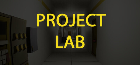
Project Lab scored 67/100 on Steam Analyzer — Solid for a Action capsule. Top priority fix: [uniqueness_polish] Introduce a distinctive visual element—a key character, branded symbol, or unique laboratory detail (e.g., glowing artifact, mutated creature silhouette)—that makes the capsule memorable and differentiates it from generic lab horror.

Capsule scores by dimension

  • Genre Clarity: 7/10 — Laboratory setting suggests sci-fi horror. The sterile, institutional lab environment with yellow warning text clearly signals a confined workplace scenario fitting a secret laboratory horror premise. At tiny size, the geometric architecture and institutional aesthetic read as sci-fi/industrial, though the horror element is subtle and relies on context rather than visual threat cues. Genre clarity is good but not exceptional—a more menacing visual would strengthen the horror signal.
  • Title Readability: 8/10 — Bold yellow text reads clearly. PROJECT LAB in large, bright yellow capital letters maintains legibility at all sizes including tiny thumbnails, with strong value contrast against the dark gray background. The two-line split is well-balanced and centered, avoiding edge crowding. At tiny size the text remains decipherable, though individual letterforms blur slightly—the all-caps, uniform sans-serif design preserves recognition through pure weight and color rather than fine detail.
  • Contrast & Color: 8/10 — Strong yellow-on-gray separation. The bright yellow (#FFD700 range) text creates excellent value separation from the dark neutral background, scoring well in both color and grayscale contrast tests. The institutional gray walls and dim lighting establish a muted mid-tone field that makes the title pop without saturation strain. The silhouette clarity is clean—text edges remain crisp even at reduced size—though the background architecture adds detail that could compete at extreme zoom-outs.
  • Uniqueness & Polish: 5/10 — Competent but generic lab aesthetic. The sterile laboratory interior is functional and thematically appropriate but visually predictable for sci-fi horror—fluorescent lighting, institutional walls, and geometric forms are common in the genre. There is no distinctive character, motif, or memorable hook that sets it apart from dozens of similar laboratory-themed games or trailers. The craft is clean but the concept feels template-driven rather than distinctive.
  • Brand Consistency: 5/10 — Minimal internal identity cues. The capsule presents a neutral institutional setting with no clear iconic character, symbol, or signature visual motif that would be recognizable across other store assets. Yellow warning coloring is thematically coherent with laboratory imagery but is generic to the setting rather than brand-specific. Without reference to the five store screenshots, there are no memorable identity markers that establish a unique brand presence.
  • Composition: 7/10 — Centered title with deep perspective. The title is well-anchored center-frame with strong focal hierarchy; the receding laboratory perspective draws the eye naturally to the text. The layered depth—foreground walls, mid-ground space, background architectural detail—creates visual interest without clutter. At small and tiny sizes the composition holds; however, the symmetric centering and neutral color palette create a somewhat static, predictable arrangement that lacks dynamic tension or surprise.

What works

  • Title legibility across sizes. Bright yellow all-caps text remains readable even at tiny thumbnail size due to high contrast and uniform weight, ensuring the game name is never lost in scroll.
  • Clear thematic environment. The institutional laboratory setting immediately communicates the secret facility premise and establishes a confined, sterile atmosphere suited to the horror context.
  • Strong color-to-background contrast. Yellow-on-dark-gray separation scores high in both RGB and grayscale modes, making the capsule stand out against Steam's dark background.

What hurts the capsule

  • Generic sci-fi horror aesthetic. The sterile lab interior is predictable for the genre and lacks a distinctive visual hook or memorable motif that differentiates it from similar laboratory-themed games.
  • No character or brand icon present. The capsule relies entirely on environment and typography with no central character, creature, or branded symbol to create emotional connection or recognition.
  • Static, symmetrical composition. The centered, balanced layout is safe but visually flat—the receding perspective provides depth but the overall arrangement feels predictable and lacks dynamic visual tension.

Priority fixes

  1. [uniqueness_polish] Introduce a distinctive visual element—a key character, branded symbol, or unique laboratory detail (e.g., glowing artifact, mutated creature silhouette)—that makes the capsule memorable and differentiates it from generic lab horror.
  2. [composition] Add asymmetrical depth or a secondary focal point (e.g., foreground warning sign, threatening shadow, or environmental hazard) to create dynamic visual tension and guide eye movement beyond the centered text.
  3. [brand_consistency] Develop a signature color accent or visual motif (beyond generic yellow warning text) that is unique to Project Lab and can be carried across store assets, social media, and marketing to build recognizable identity.

Store copy priority fixes

  1. [hook_strength] Rewrite the short description to lead with a specific tension or twist: 'You manage a secret lab's escape risks—but the creatures evolving faster than containment can handle' or similar concrete conflict.
  2. [uniqueness] Add one sentence after the creature behavior paragraph explaining what specifically distinguishes the creature AI or mechanic: e.g., 'Unlike static horror setups, creatures adapt their behavior based on your actions, forcing constant tactical rethinking.'
  3. [feature_communication] Clarify resource management with a concrete example: specify whether it is time, sanity, power, or consumables, and how running low changes gameplay difficulty or failure states.
  4. [audience_targeting] Add a sentence targeting the intended player type more explicitly: e.g., 'Perfect for puzzle-focused horror fans who value strategy over jump scares' to help self-selection.

Related guides

Steam app ID: 3841620 · Tags: Action, Horror, Adventure, First-Person, Singleplayer