Quick text summary
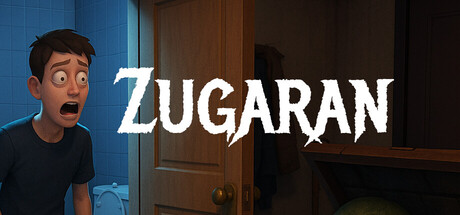
Zugaran scored 70/100 on Steam Analyzer — Good for a Adventure capsule. Top priority fix: [uniqueness_polish] Introduce a distinctive visual element—such as a signature nightmare motif, color anomaly, or character quirk—that communicates the "looping nightmare" mechanic rather than generic horror.
Capsule scores by dimension
- Genre Clarity: 7/10 — Horror intent readable at small. The anxious character expression on the left and the interior setting with stark lighting suggest psychological tension or horror. At tiny size, the facial expression becomes the primary genre cue and reads as fear or distress. However, the casual apartment setting and lack of overt supernatural iconography make it harder to distinguish horror-adventure from general mystery at tiny sizes.
- Title Readability: 8/10 — Strong bold typography holds well. ZUGARAN uses a confident, slightly irregular serif font with excellent contrast against the dark background elements. The title remains readable at small and tiny sizes due to its large point size and weight. Letter forms are distinct and the lack of decorative complexity preserves legibility during the squint test.
- Contrast & Color: 8/10 — Clean light-dark separation. White title text cuts clearly against the dark brown-blue interior background, creating strong value separation. The warm interior lighting on the left provides tonal separation from the cooler darkness on the right. In grayscale, the silhouettes remain distinct and readable at all sizes without muddy mid-tones.
- Uniqueness & Polish: 6/10 — Competent but visually familiar. The anxious character and apartment interior setting communicate the core concept of being trapped in a nightmare scenario, which aligns with the game's premise. However, the composition relies on a fairly standard first-person apartment reveal with a distressed character pose—a common visual trope that doesn't create a distinctive hook or memorable silhouette compared to top-tier peers like DREDGE or Slay the Princess.
- Brand Consistency: 6/10 — Generic horror aesthetic lacking icon. The character design and apartment interior are coherent internally, but there are no distinctive brand identity markers—no iconic symbol, signature color palette, or visual motif that would be immediately recognizable. The brown-blue-dark color scheme is naturalistic but not memorable, and the character design is relatable but not iconic enough to carry brand recall.
- Composition: 7/10 — Clear focal point with functional layout. The anxious character on the left serves as the primary focal point and draws the eye immediately, while the title anchors the right side with strong hierarchy. The apartment door and interior framing create depth, though the composition is somewhat static and centered on the character without dynamic diagonal flow. At tiny size, the left-right split reads clearly, but the supporting architectural elements compete slightly for attention.
What works
- High-contrast title legibility. Bold white ZUGARAN text maintains excellent readability at small and tiny sizes with crisp letterforms and minimal decoration.
- Clear psychological tone. The character's anxious expression and interior lighting immediately communicate nervous tension and confined unease, supporting the horror-adventure pitch.
- Depth through layering. Background interior architecture, midground character, and title placement create visual hierarchy that prevents flatness.
What hurts the capsule
- Generic apartment setting. The interior lacks distinctive design language or memorable visual hooks that differentiate it from standard first-person horror tropes.
- No iconic visual identity. Absence of a signature character design, symbol, or palette that could serve as lasting brand recognition beyond this single image.
- Static composition. The left-character-right-title arrangement is functional but lacks dynamic diagonal movement or unexpected framing that would elevate it to premium tier.
Priority fixes
- [uniqueness_polish] Introduce a distinctive visual element—such as a signature nightmare motif, color anomaly, or character quirk—that communicates the "looping nightmare" mechanic rather than generic horror.
- [brand_consistency] Develop a recognizable icon or symbol (bathroom, clock, or nightmare artifact) that could anchor brand identity across marketing and screenshots.
- [composition] Shift the layout to include an unexpected perspective or secondary element (e.g., fractured mirror, temporal loop visual) that signals the narrative hook without requiring text.
Store copy priority fixes
- [feature_communication] Rewrite 'piece together the truth behind' to 'piece together the truth behind your reality' or similar, completing the sentence grammatically.
- [feature_communication] Add 2-3 sentences explaining what 'casual' gameplay feels like—e.g., 'explore at your own pace with no time pressure' or 'observe and react rather than fight'—so players understand the horror-to-mechanics ratio.
- [uniqueness] Insert a sentence explicitly comparing this approach to other horror games—e.g., 'Unlike jump-scare-driven horror, Zugaran builds dread through environmental shifts and personal mystery' to justify the game's specific design choices.
- [tone_match] Remove or reframe 'casual and simple' from the opening of the detailed description to avoid undermining the atmospheric dread established in subsequent sentences; move 'casual' to a features or playstyle section instead.
Related guides
Steam app ID: 3842370 · Tags: Adventure, Walking Simulator, 3D, First-Person, Casual