Scoring genre clarity...
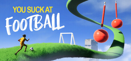
A physics-based rage game where you and your friends control a chaotic football through parkour and deadly drops. One wrong bounce and you lose it all. Climb together or fall together — can you reach the top?
$4.99Mixed(20)
Precision PlatformerPuzzle PlatformerFootball (Soccer)
Gorka GamesAug 4, 2025