Scoring genre clarity...

Impact to the Head capsule

Impact to the Head

Story-driven, first-person melee combat game. After being discharged from the military, a man turns to the occupation of a hired killer.

$2.50Mostly Positive(14)
BoxingMartial ArtsAction-Adventure
W0nnaFightMar 27, 2026

Impact to the Head scores 68/100 — better than 14% of Boxing capsules (n=64).

Mostly Positive (14 reviews) · $2.50 · Released Mar 27, 2026 · By W0nnaFight

Quick text summary

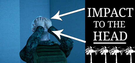
Impact to the Head scored 68/100 on Steam Analyzer — Solid for a Boxing capsule. Top priority fix: [genre_clarity] Replace generic palm tree icons with melee weapon silhouettes or environment props that reinforce first-person combat identity and hired-killer aesthetic.

Capsule scores by dimension

  • Genre Clarity: 7/10 — Action game with melee combat focus. The figure in aggressive stance with clenched fists and the directional arrows pointing to the head clearly signal combat and violence. At tiny size, the silhouette and title text 'IMPACT TO THE HEAD' communicate action-oriented gameplay, though the specific melee or first-person aspect is not visually distinctive enough to stand out from broader action titles. The palm tree icons at bottom suggest tropical setting but add minor genre confusion.
  • Title Readability: 8/10 — Strong serif typography, excellent contrast. The title 'IMPACT TO THE HEAD' is rendered in clean, bold white serif capitals on a solid black background in the right half, ensuring excellent legibility at all sizes including tiny. The underline treatment provides additional visual anchoring. At small and tiny sizes, the text remains crisp and immediately readable without blur or collapse, though the subtitle relationship is slightly unclear at extreme reduction.
  • Contrast & Color: 8/10 — Strong value separation, silhouette clarity. The composition leverages a clear dark-to-light contrast split: deep blue-teal gradient on the left with the figure, solid black on the right with white text. The figure's blue-green tones separate well from the Steam dark background #1b2838, and the white text pops distinctly against black. In grayscale, the value range is strong and the silhouette of the figure reads clearly even at tiny size, though the mid-tone figure against mid-tone gradient loses some edge definition.
  • Uniqueness & Polish: 6/10 — Competent visual but generic action scene. The composition uses professional layout principles and clean typography, with deliberate arrow annotations suggesting a tactical or instructional angle. However, the figure pose and hooded silhouette are common action/military game tropes seen across dozens of comparable titles, and the scene lacks a distinctive hook, signature character trait, or unique visual storytelling that communicates the specific hired-killer narrative or first-person melee identity. Palm trees add minimal thematic distinction.
  • Brand Consistency: 5/10 — Minimal internal identity cues. The design is internally cohesive in styling and palette, but contains no distinctive motifs, character recognizability, or signature visual elements that would build brand memory across multiple capsules. The hooded figure, blue gradient, and palm trees are generic enough that they could apply to many unrelated action games, offering no memorable identity signal that would help recognition or build series coherence. Without access to other capsule variations, the iconic potential appears low.
  • Composition: 7/10 — Clear hierarchy, minor balance issues. The left-right split creates a logical visual hierarchy: figure and action arrows on left, title dominance on right. The focal point at tiny size is the figure silhouette paired with the bold title, which reads well under quick scroll. However, the palm tree icons at bottom right feel somewhat orphaned and add visual weight that slightly dilutes focus; the figure itself is not perfectly centered in its region, and the arrow annotations, while clarifying the concept, introduce minor secondary competition for attention. Composition survives cropping well across Steam sizes.

What works

  • Excellent title legibility across all sizes. White serif type on solid black background maintains crisp readability from full header down to tiny thumbnail without collapse or blur.
  • Strong contrast against Steam dark background. Blue-teal figure and white text separate distinctly from #1b2838, with clear silhouette definition preserved at small and tiny sizes.
  • Clear directional composition and narrative clarity. Left-right split and arrow annotations effectively guide eye flow and communicate the concept of head-focused combat impact.

What hurts the capsule

  • Generic action archetype without distinctive hook. Hooded figure in aggressive stance is a common template across dozens of action and military games, failing to communicate the unique hired-killer narrative or first-person melee identity.
  • Minimal brand identity or iconic memorable elements. No distinctive character trait, signature motif, or cohesive visual language that would support recognition or build brand consistency across marketing materials.
  • Palm tree icons feel disconnected and dilute focus. Bottom-right decorative elements add tropical flavor but lack clear thematic integration and create visual weight that competes with primary composition.

Priority fixes

  1. [genre_clarity] Replace generic palm tree icons with melee weapon silhouettes or environment props that reinforce first-person combat identity and hired-killer aesthetic.
  2. [uniqueness_polish] Add a distinctive character detail or signature visual element (scarring, tattoo, gear motif, or color accent) to the figure that communicates narrative and becomes recognizable across promotional materials.
  3. [brand_consistency] Develop a cohesive color palette or motif that appears consistently in other capsules, establishing visual continuity and improving series/studio recognition.

Store copy priority fixes

  1. [feature_communication] Add 2-3 concrete gameplay examples after 'Realistic first-person combat system'—e.g., 'Engage in brutal hand-to-hand takedowns, interrogate targets, or plan silent eliminations' to show what players actually do.
  2. [uniqueness] Include a differentiator statement such as 'Uncompromising first-person melee combat where every punch matters' or reference what makes this combat system stand out from other action games in the genre.
  3. [feature_communication] Expand the story description to include a hint at the mission that 'pushes him to his absolute limits'—what is the conflict or moral choice at stake?

Related guides

Steam app ID: 3842910 · Tags: Boxing, Martial Arts, Action-Adventure, 3D, First-Person