Scoring genre clarity...
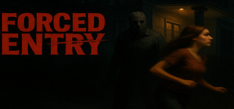
A masked serial killer has Forced Entry into your home knocking you out and locking you into the basement, You must now try to escape before its to late. Can you escape or will you become another victim of this relentless butcher.
$4.991 user reviews
IndieSimulationSingleplayer
FourAM GamesNov 22, 2025