Scoring genre clarity...

Silent Watcher capsule

Silent Watcher

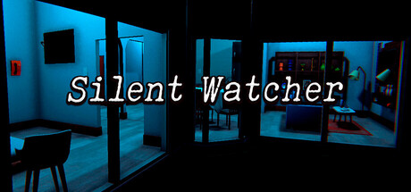
You're waiting for your partner at home. But something isn't right. You feel a presence, something watching you... from every window, every shadow. In Silent Watcher, fear isn't what you see—it's what you feel. A psychological horror where the enemy is always there.

$4.991 user reviews
ActionAdventureAction-Adventure
LaproStudio, HardtonikAug 14, 2025

Silent Watcher scores 70/100 — better than 29% of Action capsules (n=8,535).

1 user reviews · $4.99 · Released Aug 14, 2025 · By LaproStudio

Quick text summary

Silent Watcher scored 70/100 on Steam Analyzer — Good for a Action capsule. Top priority fix: [uniqueness_polish] Introduce a distinctive visual element—either a recognizable character silhouette in a window, a signature object (e.g., a specific surveillance device or artifact), or a unique lighting anomaly that signals 'Silent Watcher' specifically rather than generic horror.

Capsule scores by dimension

  • Genre Clarity: 7/10 — Psychological horror premise clear. The cool blue-tinted interior spaces with surveillance-style framing and red warning indicators clearly signal a horror or thriller game with surveillance/paranoia mechanics. At full size, the voyeuristic window views and institutional lighting establish psychological tension. At tiny size, the blue color palette and dark silhouettes still read as unsettling interior space, though specific genre nuance (psychological vs. action horror) becomes ambiguous.
  • Title Readability: 8/10 — Strong white text with italic style. The title 'Silent Watcher' uses clean white italicized text with good contrast against the dark blue background and black edges of the image. The text maintains legibility at small size due to high value contrast and sufficient letter spacing. At tiny size the italic effect becomes thin but the overall word shape remains recognizable, though fine serifs blur slightly.
  • Contrast & Color: 8/10 — Strong blue-black value separation. The cool cyan-blue interior lighting creates excellent contrast against the pure black background framing and dark silhouettes. The red accent lights provide a secondary pop that draws attention without overwhelming. Grayscale test shows clear value separation between foreground structures (mid-tone blue) and deep black voids, maintaining silhouette clarity even at tiny scale.
  • Uniqueness & Polish: 6/10 — Competent horror aesthetic without standout hook. The surveillance-room aesthetic is well-executed with consistent blue lighting and institutional set dressing that conveys the core paranoia theme. However, the visual execution follows familiar psychological horror tropes (institutional spaces, cool lighting, window framing) without a distinctive character, symbol, or unique visual mechanic that differentiates it from other indie horror titles. Feels professionally assembled but not visually memorable.
  • Brand Consistency: 6/10 — Thematic consistency but generic symbols. The institutional surveillance room aesthetic aligns with the game's paranoia theme and appears internally coherent across the composition. However, there are no distinctive visual icons, character archetypes, or signature palette elements that would make this capsule recognizable as uniquely 'Silent Watcher' versus other psychological horror games. The blue-and-black approach is thematically appropriate but not distinctly branded.
  • Composition: 7/10 — Centered title, layered room depth. The composition effectively uses layered interior spaces (multiple rooms visible through windows/doorways) to create visual depth and guide the eye inward toward a sense of being watched. Title placement is centered and floats clearly above busy background elements. At small size, the layered room structure reads as a coherent interior scene; at tiny size, the composition compresses into a blue-black gradient with centered white text that remains the clear focal point.

What works

  • High contrast title legibility. White italicized text maintains strong readability against dark backgrounds and survives scaling to tiny thumbnail size.
  • Thematic visual coherence. The blue institutional lighting, surveillance framing, and interior layering consistently reinforce the paranoia and voyeurism theme throughout.
  • Effective color separation. Cool blue subject matter pops cleanly against pure black framing and dark voids, creating distinct silhouettes in grayscale.

What hurts the capsule

  • Generic horror aesthetic. The surveillance-room setting and cool blue lighting follow familiar indie horror conventions without a distinctive visual hook or memorable identity marker.
  • Lack of character or symbol focus. The capsule shows environment only with no human figure, creature, or iconic symbol that would create emotional connection or brand memorability.
  • Limited visual storytelling novelty. The institutional interior space implies surveillance paranoia but does not hint at a unique gameplay mechanic or selling point beyond standard psychological horror.

Priority fixes

  1. [uniqueness_polish] Introduce a distinctive visual element—either a recognizable character silhouette in a window, a signature object (e.g., a specific surveillance device or artifact), or a unique lighting anomaly that signals 'Silent Watcher' specifically rather than generic horror.
  2. [brand_consistency] Add a memorable icon or motif (e.g., a stylized eye, watcher symbol, or architectural signature) that can serve as a recognizable brand marker across other marketing materials.
  3. [composition] Consider introducing a human figure or face partially visible in shadows or reflections to create emotional tension and focal interest beyond the empty rooms.

Store copy priority fixes

  1. [feature_communication] Replace 'sound, your intuition, and environmental details will be your tools' with concrete examples: e.g., 'Listen for footsteps outside windows, watch for shadows moving across curtains, search for clues in your home to understand what's stalking you.'
  2. [genre_clarity] Either remove 'Strategy' and 'Hidden Object' tags or add a sentence explaining how observation and puzzle-solving play into survival (e.g., 'Piece together clues about your unseen stalker to unlock understanding and safety.').
  3. [feature_communication] Add a sentence describing the core gameplay loop explicitly: 'Explore your home room by room, manage your fear through inspection, and react to signs of the presence drawing closer.'
  4. [audience_targeting] Add one sentence clarifying game length and intensity: e.g., 'A focused 2-3 hour experience designed for horror fans seeking sustained psychological tension over action.'

Related guides

Steam app ID: 3843270 · Tags: Action, Adventure, Action-Adventure, Exploration, Hidden Object