Scoring genre clarity...
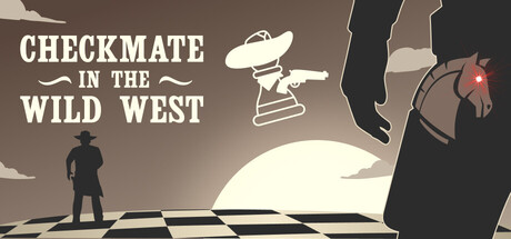
Saddle up for a Wild West chess puzzle adventure! Will you become an outlaw or a deputy? Your choices matter. Test your wits, cross paths with bandits, sheriffs, helpers, and hustlers. Solve puzzles, challenge characters, buy powerups, and determine your destiny.
$3.995 user reviews
StrategyCasualAdventure
Grouper Games LLCDec 15, 2025