Quick text summary
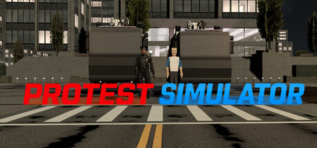
Protest Simulator scored 68/100 on Steam Analyzer — Solid for a Immersive Sim capsule. Top priority fix: [uniqueness_polish] Incorporate a distinctive visual element such as a signature protest icon, faction symbol, or stylized character silhouette to differentiate the capsule from generic city simulators.
Capsule scores by dimension
- Genre Clarity: 8/10 — Urban protest scenario clearly communicated. The street setting with crosswalk, urban buildings, and the word SIMULATOR immediately signal a management or action sim set in a city environment. At TINY size, the street perspective and 'SIMULATOR' text still read clearly enough to convey the core concept of a protest-focused game, though specific faction mechanics are not obvious from visuals alone.
- Title Readability: 8/10 — Bold dual-color title stands out well. PROTEST in bold red and SIMULATOR in bright cyan create strong separation and contrast against the dark urban background. Both words remain legible at SMALL and TINY sizes due to large letterforms and simple sans-serif weight, though TINY viewing may compress some letter clarity slightly.
- Contrast & Color: 8/10 — High-value red and cyan pop effectively. The red and cyan title colors create excellent separation against the dark street scene and Steam background #1b2838. The street elements below maintain readable detail through neutral grays and black, with the yellow road markings adding secondary visual interest that guides the eye without competing for focus.
- Uniqueness & Polish: 5/10 — Straightforward execution, limited distinctive hook. The capsule uses a literal street protest setting with in-game screenshot rather than stylized art or unique visual branding that sets it apart from other simulator titles. While competent, it lacks a memorable visual motif, character, or thematic symbol that would signal a unique selling point or core mechanic beyond the obvious protest theme.
- Brand Consistency: 5/10 — Generic urban sim aesthetic, no signature identity. The photorealistic street environment and functional layout feel standard for city simulators without distinctive art direction, color palette hierarchy, or iconic visual symbols that would make Protest Simulator recognizable across touchpoints. No character, motif, or UI style element establishes a memorable brand signature.
- Composition: 7/10 — Balanced depth with clear focal point. The title occupies the center-foreground with the street scene receding in perspective, creating natural depth and hierarchy. At TINY size the composition still reads as a cohesive scene, though the street detail in the background becomes less distinct and the title dominates the visual weight appropriately.
What works
- Strong title contrast and legibility. Red and cyan text choices ensure readable clarity across FULL, SMALL, and TINY viewing sizes with no outline or shadow needed.
- Clear genre and setting communication. The urban street environment with crosswalk immediately signals a city-based simulation without ambiguity about the core setting.
- Balanced visual composition with depth. Foreground title, midground street elements, and background buildings create layered depth that reads well at reduced sizes.
What hurts the capsule
- Generic photorealistic aesthetic. The in-game screenshot feels like a standard city simulator without stylized art direction or unique visual identity that distinguishes it from competing titles.
- No memorable brand iconography. Absence of signature character, symbol, or color palette that would make the game visually recognizable in later marketing or storefront contexts.
- Mechanical gameplay unclear from visuals. Title and street scene do not communicate the choice mechanic or faction gameplay described in the product description.
Priority fixes
- [uniqueness_polish] Incorporate a distinctive visual element such as a signature protest icon, faction symbol, or stylized character silhouette to differentiate the capsule from generic city simulators.
- [brand_consistency] Establish a consistent color palette or motif (protester vs. police visual cue) visible in the title treatment or background that signals the core dual-choice mechanic and builds recognizable brand identity.
- [genre_clarity] Add a subtle UI element, prop, or composition cue in the street scene that hints at player choice mechanics or faction gameplay to clarify the simulation's unique hook.
Store copy priority fixes
- [hook_strength] Rewrite the detailed description opening to lead with the core dual-choice mechanic: 'Command riot control as the police or orchestrate street resistance as a protester—each side plays by different rules and reshapes the city differently each night.'
- [feature_communication] For each major mechanic (molotov crafting, suppression tools, media impact, slogan system), add one sentence explaining how it affects moment-to-moment gameplay and interacts with the opposing side's counter-tactics.
- [audience_targeting] Add a sentence clarifying the difficulty, session length, and target player type (e.g., 'Designed for players who want deep systems and replayability' or 'Casual-friendly with depth for hardcore players') to resolve the Casual tag contradiction.
- [uniqueness] In the 'CHOOSE YOUR SIDE' section, add specific examples of how protester and police asymmetry creates distinct emergent scenarios (e.g., 'Police use predictive AI patrolling; protesters exploit crowd psychology to hide in plain sight') to prove the mechanic is substantive.
Related guides
Steam app ID: 3846760 · Tags: Immersive Sim, Simulation, Crime, Political, Action-Adventure