Don't Stop In Red Wood scores 62/100 — better than 3% of Adventure capsules (n=7,922).

Quick text summary

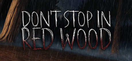
Don't Stop In Red Wood scored 62/100 on Steam Analyzer — Solid for a Adventure capsule. Top priority fix: [genre_clarity] Introduce a hunter silhouette, creature outline, or iconic weapon in the mid-ground to immediately signal action-adventure identity and differentiate from pure horror atmosphere.

Capsule scores by dimension

  • Genre Clarity: 7/10 — Horror-action atmosphere established. The rain, dark wood setting, and blood-red text clearly signal a dark action-adventure or horror title. The ominous atmosphere and 'hunter reborn' concept align with survival or creature-hunting gameplay expectations. At tiny size, the rain texture and red-on-dark palette remain readable enough to communicate threat and tension, though specific genre mechanics aren't visually explicit.
  • Title Readability: 6/10 — Readable but strained hierarchy. The title 'DON'T STOP IN RED WOOD' is white and red with spaced letterforms that read clearly at full and small sizes. However, at tiny size the spacing becomes tight and the two-line break reduces impact; the outline/stroke is thin and vulnerable to collapse. The decorative hand-drawn style works at medium scale but loses precision at thumbnail, where individual letters blur slightly.
  • Contrast & Color: 7/10 — Strong value separation overall. White title text contrasts sharply against the dark rain-and-wood background, and red accent words provide secondary contrast and emotional weight. The dark blue-gray sky and brown wood create clear depth layers. In grayscale, the title remains distinct, though the red wood tones flatten to mid-gray, reducing its silhouette pop at tiny size against the dark surround.
  • Uniqueness & Polish: 6/10 — Atmospheric but template-adjacent. The rain overlay, dark wood setting, and hand-drawn text style evoke indie horror polish and fit the narrative of a 'hunter reborn.' The concept is thematically coherent but visually relies on common dark-forest and rain-effect tropes common in horror game marketing. The craft is clean, but the visual hook lacks a distinctive character, creature, or symbol that would elevate it beyond a competent mood piece.
  • Brand Consistency: 5/10 — No memorable identity signals. The capsule establishes a dark, rain-soaked horror mood but contains no iconic character, logo, creature silhouette, or signature visual motif that anchors a recognizable brand identity. The hand-drawn title font is the only distinctive asset, but it's generic enough that similar lettering appears on many indie horror titles. Without reference to the six store screenshots, this capsule alone would not be visually memorable or self-identifying.
  • Composition: 6/10 — Centered layout, safe margins. The title occupies the center with balanced white space on left and right; the wood edge frames the left side providing visual boundary and depth. The rain and dark gradient fill the background without clutter. However, there is no clear secondary focal point or depth layering beyond atmospheric texture—the composition is static and symmetrical, which reads safely but feels passive at all sizes.

What works

  • Dark mood consistency. The rain, wood, and color palette cohesively communicate dread and wilderness threat without contradiction or mixed messaging.
  • Title legibility at small size. White and red text with adequate contrast remains readable even when scaled down, supporting quick visual parsing during Steam browse.
  • Thematic alignment with description. The visual atmosphere directly supports the narrative hook of a 'hunter reborn' and cold-forest setting, creating narrative-visual synergy.

What hurts the capsule

  • Generic horror aesthetic. Rain, dark wood, and red blood text are standard indie horror tropes without a distinctive twist or signature visual that anchors brand recall.
  • No focal subject or creature. The capsule is a pure environmental mood shot with no protagonist, antagonist, or character silhouette to anchor player engagement or suggest gameplay immediately.
  • Composition feels static. Centered symmetrical layout with no dynamic focal hierarchy or layered depth beyond atmospheric texture results in a passive, uninviting first impression.
  • Red text fades at tiny scale. The red-on-dark wood portions of the title lose distinctiveness when thumbnailed, reducing the dramatic color accent's impact on quick scroll.

Priority fixes

  1. [genre_clarity] Introduce a hunter silhouette, creature outline, or iconic weapon in the mid-ground to immediately signal action-adventure identity and differentiate from pure horror atmosphere.
  2. [uniqueness_polish] Add a signature visual element—a unique creature design, branded symbol, or distinctive character feature—that creates immediate brand recognition and stands out from competing dark-forest indies.
  3. [composition] Establish a clear focal point with foreground-midground-background layering; consider asymmetrical balance or a dominant subject to create visual tension and draw the eye beyond the center.
  4. [title_readability] Increase title outline thickness or add a darker background panel behind text to prevent red lettering from softening when compressed to tiny thumbnail size.

Store copy priority fixes

  1. [feature_communication] Add a single sentence early in the detailed description that explains the core gameplay loop: 'Survive encounters with [antagonist], uncover the mystery of Red Wood through exploration and puzzle-solving' or similar—clarify what the player does moment-to-moment.
  2. [hook_strength] Strengthen the short description by adding a gameplay verb or survival element after the atmospheric hook: e.g., 'A legend returns: the cold pines of Red Wood whisper of a hunter reborn… Can you survive his return?' or 'A legend returns to Red Wood—and now you must evade him.'
  3. [uniqueness] Add 1-2 sentences explaining what makes Red Wood's story, antagonist, or mechanics distinct from other PS1-style horror games (e.g., specific narrative twist, unique hazard, asymmetric gameplay).
  4. [feature_communication] Define what 'mix of modern gameplay' means concretely—e.g., 'modern checkpoint saves', 'updated UI', 'quality-of-life features', so players understand how this honors the era without punishing archaic design.

Related guides

Steam app ID: 3847330 · Tags: Adventure, Action, Action-Adventure, 3D, Cinematic