Quick text summary
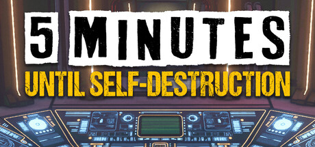
5 Minutes Until Self-Destruction scored 70/100 on Steam Analyzer — Good for a Puzzle capsule. Top priority fix: [uniqueness_polish] Add a distinctive character, object, or visual motif (e.g., a countdown timer, warning symbol, or silhouette of a protagonist) that signals this game's unique hook and differentiates it from generic escape room templates.
Capsule scores by dimension
- Genre Clarity: 7/10 — Escape room puzzle premise clear. The neon-lit control panel and digital UI elements immediately signal a sci-fi puzzle or escape room context, supported by the 'self-destruction' text suggesting high-stakes scenario gameplay. At TINY size, the glowing blue dashboard still reads as a tech/puzzle environment, though the specific genre feels slightly generic without clearer puzzle or interaction hints.
- Title Readability: 8/10 — Bold, high-contrast title readable. The white and gold text blocks sit cleanly against the dark background with excellent value separation and heavy sans-serif letterforms that hold at all sizes. Even at TINY size, both lines remain legible due to large cap letters and strategic color blocking, though the tagline is small enough to become challenging at extreme reduction.
- Contrast & Color: 8/10 — Strong neon-to-dark separation. The bright cyan and orange dashboard elements pop distinctly against the dark brown/purple background, creating clear silhouettes and visual hierarchy that survives the squint test and grayscale conversion. The white title text provides maximum contrast and the warm/cool color split reinforces visual interest without muddiness.
- Uniqueness & Polish: 6/10 — Competent retro-tech aesthetic. The neon-lit control panel and pixel-style digital readout evoke a familiar sci-fi escape room vibe, but the composition feels like a stock setup rather than a signature visual hook that distinguishes this specific game. The execution is clean and professional, but lacks a distinctive character, mechanic reveal, or memorable motif that would elevate it above the baseline indie aesthetic.
- Brand Consistency: 6/10 — Generic sci-fi presentation. The dashboard UI and retro-neon styling are internally cohesive but feel more like a genre convention than a unique brand identity that would be recognizable across marketing materials. Without visible game-specific characters, logo systems, or distinctive palette markers, the capsule reads as 'escape room game' rather than '*this* escape room game.'
- Composition: 7/10 — Clear hierarchy, balanced layout. The title anchors the top with strong visual weight, the dashboard occupies the center and lower frame as a supporting focal point, and negative space balances the elements without creating dead zones. At SMALL and TINY sizes the title and dashboard remain the clear primary subjects, though the wide horizontal dashboard slightly compresses when scaled and the lower UI details risk becoming noise at thumbnail size.
What works
- Excellent title contrast and legibility. White and gold text blocks maintain perfect readability against the dark background even at TINY size due to large, heavy letterforms and deliberate color blocking.
- Cohesive neon sci-fi atmosphere. The cyan and orange glowing dashboard creates a unified visual tone that clearly communicates a high-tech, urgent scenario without confusion about game type.
- Strategic value separation. The bright digital UI elements contrast sharply against the dark background, ensuring silhouettes read cleanly in grayscale and survive quick-scroll viewing.
What hurts the capsule
- Generic escape room aesthetic. The neon dashboard setup feels like a familiar template rather than a distinctive visual identity tied to this specific game's unique mechanics or story.
- Dashboard detail loss at thumbnail scale. Fine grid lines and screen details in the central UI become illegible noise at TINY size, reducing the clarity of the intended focal point.
- No game-specific character or icon. The capsule lacks a memorable character, mascot, or signature symbol that would make this game recognizable versus other sci-fi escape room entries.
Priority fixes
- [uniqueness_polish] Add a distinctive character, object, or visual motif (e.g., a countdown timer, warning symbol, or silhouette of a protagonist) that signals this game's unique hook and differentiates it from generic escape room templates.
- [brand_consistency] Introduce a cohesive icon or logo mark that could serve as a recognizable brand element across future marketing and store pages.
- [composition] Simplify or reduce non-essential dashboard details to prevent visual noise at SMALL and TINY sizes; consider removing or stylizing grid overlays that collapse at thumbnail scale.
Store copy priority fixes
- [feature_communication] Add 1-2 sentences explaining what types of minigames or puzzle mechanics players encounter (e.g., 'wire-cutting puzzles, code-breaking challenges, and spatial logic tests').
- [uniqueness] Insert a sentence articulating what makes the spaceship setting or puzzle interconnection unique (e.g., 'Every puzzle you solve cascades through the ship, unlocking new areas and solutions in ways no other escape game delivers').
- [audience_targeting] Reframe the opening to emphasize this is a short, replayable arcade experience ('A lightning-fast escape room built for multiple runs and speed-running') rather than leaning equally toward both casual and hardcore audiences.
Related guides
Steam app ID: 3849740 · Tags: Puzzle, Casual, Arcade, 3D, First-Person