Scoring genre clarity...

Clobber Barons capsule

Clobber Barons

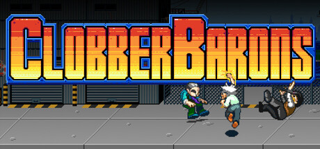
A short, arcade-style throw back to the beat 'em ups of the early 90's. Use the money you beat out of wealthy criminals to charge your power attacks while attempting to find the mastermind behind the criminal racket taking over your city.

$7.995 user reviews
ActionCasual2D Fighter
Stanli LLCSep 2, 2025

Clobber Barons scores 75/100 — better than 70% of Action capsules (n=8,534).

5 user reviews · $7.99 · Released Sep 2, 2025 · By Stanli LLC

Quick text summary

Clobber Barons scored 75/100 on Steam Analyzer — Good for a Action capsule. Top priority fix: [composition] Shift the motorcycle figure left by 15-20 pixels to create safe margin clearance from the right edge and reduce Steam crop risk.

Capsule scores by dimension

  • Genre Clarity: 8/10 — Clear beat 'em up arcade vibes. The pixel art characters in combat poses, visible protagonist and enemies on a street setting, and the arcade-style typography immediately signal a retro action beat 'em up. At TINY size, the character silhouettes and action stance remain readable, though fine details like individual frames blur slightly. The genre is unambiguous—this is classic side-scrolling brawler material.
  • Title Readability: 8/10 — Bold title readable at small sizes. CLOBBER BARONS uses thick, high-contrast letterforms with a distinctive red-to-yellow gradient fill and solid blue outline that maintains legibility even when scaled down. The title placement spans the upper two-thirds without sitting on busy texture, and the outline treatment preserves character definition at SMALL and TINY sizes. Word spacing is generous and clear, supporting quick recognition during scroll.
  • Contrast & Color: 8/10 — Strong value separation on dark. The warm orange-red gradient of the title and character sprites create bright, high-value contrast against the dark #1b2838 background and dark building silhouettes. Even in grayscale stress test, the title and figures maintain clear edge separation and don't blend into the background. The blue outline reinforces definition, though the lower-right motorcycle figure reads slightly darker and could be aided by stronger rim lighting.
  • Uniqueness & Polish: 7/10 — Polished retro style, recognizable hook. The capsule demonstrates strong craft in its pixel art execution, cohesive color grading, and intentional typographic treatment that feels premium rather than rushed. The character animation frames and arcade storefront backdrop communicate the 90s beat 'em up nostalgia effectively. However, the scene composition and visual hook—while competent—don't introduce a novel mechanic or distinctive angle that separates it from other retro action games beyond solid execution.
  • Brand Consistency: 7/10 — Coherent arcade aesthetic, minimal motifs. The pixel art style, warm color palette, and arcade signage create a recognizable internal identity that would be consistent across game screens. The title treatment and character sprites establish a clear visual language. However, there are no iconic character silhouettes, recurring symbols, or signature motifs visible that would make Clobber Barons immediately recognizable on sight alone compared to stronger brand identities in action games.
  • Composition: 7/10 — Clear focal hierarchy, slight balance concern. The oversized title dominates the upper region with strong hierarchy, and the arcade storefront with characters provides a secondary focal point at mid-lower. The composition layers background building, storefront, and foreground characters logically. At TINY size, the title and character group remain the clear subjects. The right-aligned motorcycle figure and left arcade window are balanced but don't compete with the primary focal area, though the lower-right figure sits close to the edge and risks Steam crop loss on some platform displays.

What works

  • Readable title at all scales. The bold, outlined typography maintains letterform clarity and word recognition from FULL down to TINY size without decorative collapse.
  • Strong color-to-background contrast. Warm orange-red title and character sprites pop distinctly against the dark Steam background even at small sizes and in grayscale.
  • Coherent arcade beat 'em up setting. The pixel art characters, storefront backdrop, and action poses communicate genre and era unambiguously without ambiguity.
  • Clean craft and polished execution. Sprite work, outline treatment, gradient application, and overall visual finish feel intentional and premium rather than asset-store generic.

What hurts the capsule

  • Right-edge character placement risk. The motorcycle figure on the lower right sits dangerously close to the crop boundary and may be partially cut on some platform displays.
  • Limited distinctive brand motifs. No iconic character symbol, recurring visual pattern, or signature design element that would make the game instantly recognizable outside this capsule.
  • Generic scene composition. While competent, the street storefront setting and character grouping follow familiar beat 'em up conventions without a novel visual hook or mechanic hint.
  • Motorcycle figure silhouette darkness. The lower-right character reads slightly too dark and could benefit from stronger rim lighting to match the brightness hierarchy of the title and foreground figures.

Priority fixes

  1. [composition] Shift the motorcycle figure left by 15-20 pixels to create safe margin clearance from the right edge and reduce Steam crop risk.
  2. [uniqueness_polish] Add a subtle iconic motif—such as a recurring dollar sign, power meter visual, or criminal boss profile hint—to increase brand memory and visual distinctiveness.
  3. [contrast_color] Increase the rim lighting or outline brightness on the lower-right character to match the value hierarchy and silhouette separation of the title and primary foreground figures.
  4. [genre_clarity] Consider adding a subtle UI element—such as a money counter, power bar, or wanted poster—in the background to hint at the unique 'beat money out of criminals' mechanic.

Store copy priority fixes

  1. [hook_strength] Rewrite the opening to lead with 'Beat criminals bloody, snatch their cash, and race enemies to charge devastating power attacks' to lead with the unique money mechanic and create immediate curiosity.
  2. [audience_targeting] Add 1-2 sentences specifying difficulty level, estimated playtime, and whether it's designed for casual players or beat 'em up veterans, given the mixed 'Casual' + 'Arcade' positioning.
  3. [uniqueness] Insert an explicit differentiator sentence like 'Unlike traditional beat 'em ups, your defeated enemies don't stay down—they compete with you to grab dropped money and power up, forcing constant strategy' to frame the unique competitive mechanic.

Related guides

Steam app ID: 3850280 · Tags: Action, Casual, 2D Fighter, Beat 'em up, Side Scroller