Scoring genre clarity...
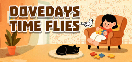
Welcome to "DoveDays"! This is an engaging and compact casual puzzle game. Easy to use, simple to solve puzzles. We have combined the essence elements of various casual puzzle games. Without complicated operations, just open and play. It is both a stress-reliever and a brain-energizer.
$4.99Positive(49)
CasualRelaxingEducation
Suiun Game (水云游戏)Jan 21, 2026