BarrelBots scores 68/100 — better than 22% of Puzzle capsules (n=4,408).

Quick text summary

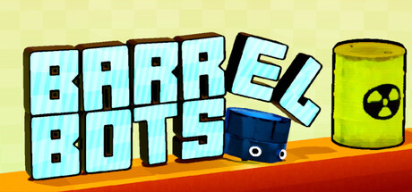
BarrelBots scored 68/100 on Steam Analyzer — Solid for a Puzzle capsule. Top priority fix: [title_readability] Thicken the outline stroke on BARREL BOTS by 15–20% to strengthen edge definition at TINY size on dark backgrounds.

Capsule scores by dimension

  • Genre Clarity: 7/10 — Puzzle mechanics clear, casual tone apparent. The bright, colorful art style and grid-based robot character with barrel immediately signal a casual puzzle game. At TINY size, the barrel and robot silhouettes remain recognizable, though the specific puzzle-stacking mechanic is not obvious from the visual alone. The nuclear waste symbol on the barrel adds thematic clarity but doesn't strengthen genre recognition beyond 'puzzle game.'
  • Title Readability: 8/10 — Bold readable title, strong outline. BARREL BOTS uses a chunky, cyan-outlined sans-serif font with excellent contrast against the pale yellow background. The title remains readable at SMALL size due to thick letterforms and clean spacing. At TINY size, the letters collapse slightly but individual shapes stay distinguishable, with only minor aliasing affecting clarity.
  • Contrast & Color: 7/10 — Warm palette pops, edges could sharpen. The pale yellow background contrasts well with the cool cyan text and warm orange wave at the bottom, creating visual separation across the full header. The blue robot and yellow barrel maintain distinct silhouettes at small sizes. However, the title outline is relatively thin and could benefit from stronger edge definition to maintain crisp separation at TINY size against darker Steam backgrounds.
  • Uniqueness & Polish: 6/10 — Competent, charming but derivative. The art style is clean and appealing with a playful cartoon aesthetic and consistent line-weight outlines. The composition tells a straightforward story of robots moving barrels. The execution is solid but lacks a distinctive hook or memorable visual element that differentiates it from other casual indie puzzle games in this space—it reads as well-made but not particularly standout.
  • Brand Consistency: 6/10 — Cohesive internal style, limited identity signal. The capsule maintains consistent rendering with uniform outline weight, flat colors, and a unified cartoon aesthetic. The nuclear barrel motif appears as a recognizable symbol, but there is no signature character pose, iconic motif, or distinctive palette cue that would create strong brand recall on a second viewing. The style is coherent but generic within the casual indie space.
  • Composition: 7/10 — Clear focal point, balanced layout. The title dominates the upper left, the robot-barrel pair anchors the center-right, and the warm orange wave grounds the lower edge, creating clear depth and visual hierarchy. The layout reads well at SMALL size with good focal point separation. The robot and barrel are positioned safely within margins and will survive Steam's typical cropping without critical loss, though the right edge of the barrel sits slightly close to the boundary.

What works

  • Bold, readable title with strong outline. The chunky cyan-outlined BARREL BOTS font maintains legibility across full to TINY sizes due to thick strokes and clean letterforms.
  • Coherent cartoon aesthetic. Consistent line-weight outlines and flat color palette create a unified, professional appearance that reads as intentional craft.
  • Clear visual hierarchy and composition. Title, character, and environmental elements are well-spaced with a clear focal point that guides the eye naturally without clutter.

What hurts the capsule

  • Generic visual identity. The style and subject matter lack a distinctive hook or memorable motif that would enable brand recognition beyond the title alone.
  • Title outline could be heavier. The cyan outline on the title, while readable, is relatively thin and may lose edge sharpness against Steam's dark background at TINY size.
  • Puzzle mechanic not visually implied. The grid-based stacking gameplay is not communicated by the visual composition, leaving genre expectation slightly ambiguous at a glance.

Priority fixes

  1. [title_readability] Thicken the outline stroke on BARREL BOTS by 15–20% to strengthen edge definition at TINY size on dark backgrounds.
  2. [uniqueness_polish] Add a visual cue that hints at the stacking or grid-based mechanic—such as layered barrels, robot in mid-action pose, or subtle grid pattern in the background.
  3. [genre_clarity] Consider a second small supporting visual—such as a robot arm reaching toward a barrel or stacked barrels—to communicate the puzzle-stacking core loop more directly.

Store copy priority fixes

  1. [uniqueness] Specify what the 'unexpected twists' are—e.g., 'barrels that behave in unconventional ways' or 'gravity and conveyor mechanics' or a concrete example of a mechanic unique to BarrelBots versus standard Sokoban.
  2. [hook_strength] Rewrite the opening to lead with the most memorable or novel aspect of the game, not just 'small robots carry barrels'—e.g., 'Stack radioactive barrels in zero gravity' or 'Guide quirky robots through impossible spatial puzzles.'
  3. [feature_communication] Expand the detailed description to explain 1–2 core mechanics beyond grab-and-stack, showing how 'simple rules open into deep possibilities' with a concrete example.
  4. [tone_match] Integrate accessibility features into the prose flow rather than a separate checklist—e.g., 'Stuck? Undo freely. No timers. No audio puzzles. Just pure logic.' to maintain the conversational voice.

Related guides

Steam app ID: 3851470 · Tags: Puzzle, Logic, Difficult, 3D, Sokoban