Scoring genre clarity...

The Darkest Dusk  capsule

The Darkest Dusk

Classic Point-and-Click Adventure Game to experience the feeling from the 80's and 90's | Tech-Noir | Pixel Art and Retro Style | Interactive visual novel

Free to PlayPositive(25)
Visual NovelPoint & ClickAdventure
Flavio ValenziJul 29, 2025

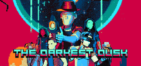
The Darkest Dusk scores 73/100 — better than 64% of Visual Novel capsules (n=1,147).

Positive (25 reviews) · Free to Play · Released Jul 29, 2025 · By Flavio Valenzi

Quick text summary

The Darkest Dusk scored 73/100 on Steam Analyzer — Good for a Visual Novel capsule. Top priority fix: [composition] Increase character silhouette separation by reducing overlap or adding subtle negative space gaps to prevent muddy compression at tiny sizes

Capsule scores by dimension

  • Genre Clarity: 8/10 — Strong retro adventure vibes. The pixel art style, neon cyan and magenta color palette, and tech-noir aesthetic immediately signal a retro point-and-click adventure game. At tiny size, the silhouette of the central character figure and the distinct cyan/magenta color blocking remain readable and genre-appropriate. The visual language aligns well with 80s/90s nostalgia positioning, though the exact gameplay type (visual novel vs. pure adventure) is not immediately obvious from visuals alone.
  • Title Readability: 7/10 — Readable with minor scaling concerns. The title 'THE DARKEST DUSK' uses a bold cyan blocky sans-serif with yellow/orange outline and black drop shadow, positioned on an orange/red gradient base. At small size it remains legible; at tiny size the outline thickness maintains clarity but fine serifs and the drop shadow begin to collapse slightly. The strategic placement on the lower third with a solid color foundation helps readability compared to placing it over the noisy character crowd above.
  • Contrast & Color: 8/10 — Bold neon palette with strong separation. The magenta/hot pink background contrasts sharply with cyan neon accents and the orange gradient bar at bottom, creating excellent value separation against Steam's dark background. Character silhouettes read clearly even at tiny size due to distinct cyan and warm tones layered over dark space visuals. In grayscale, the contrast holds well, though the mid-tone orange gradient bar is the weakest element in terms of separation.
  • Uniqueness & Polish: 7/10 — Distinctive retro aesthetic, generic composition. The neon tech-noir color grading and pixel art execution feel intentional and cohesive, with a clear visual identity distinct from generic indie adventure templates. However, the composition of clustered characters in a stacked lineup is a familiar trope in adventure game marketing; the capsule succeeds through style and color strength rather than a unique compositional hook or visual storytelling angle. The craft is solid but the concept feels predictable within the retro adventure space.
  • Brand Consistency: 7/10 — Consistent palette and mood throughout. The cyan, magenta, and orange neon color scheme is carried consistently across the character group, background environment, and title treatment, creating a recognizable visual identity. The pixel art rendering style and lighting (cyan rim lighting on characters) reinforce a cohesive tech-noir brand voice. While the palette is distinctive, there is no single iconic character, symbol, or motif that would anchor immediate recognition on future capsules—identity relies on color and style rather than a mascot or logo.
  • Composition: 7/10 — Clear focal point with balanced depth. The central tall character in the middle-right creates a strong vertical focal point that draws the eye, with supporting characters flanking left and right in a balanced arrangement. The warm orange gradient base grounds the composition and prevents the character group from floating aimlessly. At tiny size, the hierarchy remains intact and readable, though the density of overlapping character silhouettes risks becoming a muddy blur on very low resolution displays; the composition is resilient but not optimal for extreme downscaling.

What works

  • Cohesive neon aesthetic. The cyan and magenta color palette is bold, instantly recognizable, and stands out sharply against Steam's dark background.
  • Strong silhouette clarity. Character figures maintain readable edges and separate visually at small sizes due to consistent lighting and color blocking.
  • Intentional title placement. The title sits on a solid orange gradient base that isolates it from the busy character crowd, improving legibility across scales.

What hurts the capsule

  • Generic character lineup composition. The stacked group of characters is a familiar indie adventure trope that does not communicate a unique selling point or core mechanic.
  • No iconic brand symbol. The identity relies entirely on color and style rather than a memorable character, logo, or motif that could be recognized independently.
  • Character cluster at tiny scale. At very small sizes, overlapping pixel art figures risk blending into an illegible silhouette mass, reducing visual impact in scrolling lists.

Priority fixes

  1. [composition] Increase character silhouette separation by reducing overlap or adding subtle negative space gaps to prevent muddy compression at tiny sizes
  2. [uniqueness_polish] Introduce a visual storytelling element—such as an environmental detail, UI diegetic element, or compositional hook—that hints at the tech-noir or narrative angle and differentiates from generic adventure lineups
  3. [brand_consistency] Develop a signature symbol, icon, or character that can anchor future marketing materials and become synonymous with the brand

Store copy priority fixes

  1. [hook_strength] Rewrite the opening line to lead with Warden's personal conflict or goal rather than genre tags—e.g., 'Uncover the secrets of a mysterious tech-noir building before time itself collapses—solve puzzles, interrogate strange characters, and navigate a story where every choice matters.' This moves from aesthetic to agency.
  2. [feature_communication] Add a 1-2 sentence summary of puzzle style, dialogue choice scope, and estimated playtime to help players understand the gameplay depth and duration expectation.
  3. [uniqueness] Clarify what makes The Darkest Dusk distinct—e.g., dynamic narration system, multiple endings based on dialogue choices, or specific story hooks that set it apart from classic adventure games.
  4. [audience_targeting] Explicitly address free-to-play players by emphasizing no paywalls or cosmetic focus (if applicable) and highlight that this is a complete, story-driven experience, not a server-based game.

Related guides

Steam app ID: 3851650 · Tags: Visual Novel, Point & Click, Adventure, 2D, Noir