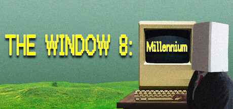
The Window 8:Millennium scores 63/100 — better than 7% of Adventure capsules (n=7,922).

Quick text summary

The Window 8:Millennium scored 63/100 on Steam Analyzer — Solid for a Adventure capsule. Top priority fix: [title_readability] Simplify subtitle on monitor screen—remove or enlarge 'Millennium' text to ensure it remains readable at tiny size, or consolidate the full title to the left yellow text only.

Capsule scores by dimension

  • Genre Clarity: 7/10 — Retro horror vibe readable. The vintage computer aesthetic with a CRT monitor clearly signals a retro-horror or psychological thriller game. At tiny size, the old PC silhouette and green background are distinct enough to suggest an unsettling 80s/90s tech theme, though the genre leans abstract rather than concrete. The setup communicates 'something is wrong with this computer' effectively, supporting the psychological horror premise.
  • Title Readability: 5/10 — Title legible at full, struggles tiny. At full header size, 'THE WINDOW 8: Millennium' reads clearly in bright yellow against the teal background. However, at tiny thumbnail size (120x45), the yellow text becomes thin and difficult to parse, and the colon-separated subtitle 'Millennium' on the monitor screen is nearly unreadable. The strategic yellow color helps, but the multi-line layout and small secondary text collapse under compression.
  • Contrast & Color: 7/10 — Strong yellow pop, solid separation. The bright yellow title contrasts sharply against the teal-green background and stands out well against the Steam dark theme #1b2838. The cream-colored monitor and black screen create clear silhouettes in the mid-composition. At tiny size, the yellow maintains visibility, though fine details like the monitor bezel blur; the overall value separation between title and background remains strong even when squinted.
  • Uniqueness & Polish: 6/10 — Retro aesthetic competent generic. The vintage computer visual is thematically appropriate and supports the Millennium horror premise, but the execution feels like a stock retro-tech setup rather than a distinctive art direction. The monitor appears to be a standard 3D render without signature style or unusual visual storytelling that hints at the game's core mechanical hook. It communicates the setting clearly but lacks the premium polish or memorable visual identity of top-tier indie releases like DREDGE or The Invincible.
  • Brand Consistency: 6/10 — Thematic alignment present, limited identity. The retro computer is consistent with the Millennium-era psychological horror theme and aligns with the game's narrative hook about a doorway and Y2K atmosphere. However, without reference to the 5 store screenshots, there are no iconic character designs, repeated motifs, or signature color palettes that establish a strong recognizable brand identity. The capsule works as a thematic piece but does not yet signal a distinctive visual vocabulary.
  • Composition: 7/10 — Clear focal point, balanced layout. The monitor is centrally positioned as the primary focal point, with the yellow title anchoring the left side and the green ground plane grounding the bottom. At small size, the hierarchy holds—the monitor and title remain the clear subjects with no competing elements. Margins are reasonable and safe from Steam's standard cropping, though the monitor edges sit near the right margin at full size.

What works

  • Yellow title pops against background. The bright yellow text has strong value contrast against both the teal backdrop and the Steam dark theme, ensuring the title catches the eye in quick scroll.
  • Thematic cohesion with Millennium concept. The vintage 80s/90s computer aesthetic directly reinforces the game's Y2K horror hook and makes the psychological premise instantly recognizable.
  • Clear focal point hierarchy. The monitor sits as an unambiguous primary subject with the title supporting it, creating a readable composition that doesn't scatter attention.

What hurts the capsule

  • Title collapses at tiny thumbnail size. The multi-line yellow text and especially the secondary 'Millennium' subtitle become too small and blurry to reliably parse at 120x45 pixels.
  • Generic retro-tech execution. The monitor and aesthetic are appropriate but feel like standard 3D asset placement rather than a distinctive art style or premium visual hook that would stand out among peer indie games.
  • Weak brand identity signals. No iconic character, repeated motif, or signature palette that would allow the capsule to be recognized as belonging to this specific game in future marketing or community contexts.

Priority fixes

  1. [title_readability] Simplify subtitle on monitor screen—remove or enlarge 'Millennium' text to ensure it remains readable at tiny size, or consolidate the full title to the left yellow text only.
  2. [uniqueness_polish] Add a distinctive visual hook to the monitor display (e.g., glitchy scanlines, an eerie eye motif referencing the description, or unsettling on-screen content) that signals the game's psychological horror core and differentiates it from generic retro-tech.
  3. [title_readability] Consider a subtle outline or shadow on the yellow title to reinforce edge definition and readability when compressed to thumbnail sizes.

Store copy priority fixes

  1. [feature_communication] Move the structured Features section to the beginning of the detailed description and expand each with 1-2 concrete gameplay examples (e.g., 'Use the lens tool to identify anomalies hidden in 90s-style photographs to unlock story branches').
  2. [genre_clarity] Add a single sentence after the short description that explicitly names the core gameplay loop: 'Solve puzzles, find hidden objects, and uncover multiple story endings through an unreliable AI companion's guidance.'
  3. [audience_targeting] Include a brief line clarifying difficulty and tone expectations (e.g., 'Built for players who enjoy narrative puzzle-mystery games with psychological horror themes—no extreme gore or jumpscare reliance').
  4. [feature_communication] Explain what 'META elements' means with a concrete example in the Features section (e.g., 'Solve puzzles by referencing external files or images outside the game world').

Related guides

Steam app ID: 3853120 · Tags: Adventure, Psychological Horror, Horror, 2D, Immersive Sim