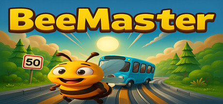
Bee Master scores 70/100 — better than 29% of Action capsules (n=8,534).

Quick text summary

Bee Master scored 70/100 on Steam Analyzer — Good for a Action capsule. Top priority fix: [uniqueness_polish] Add a distinctive visual signature or unique character detail (e.g., special crown, glowing aura, or iconic expression) that makes the bee instantly memorable and sets the capsule apart from generic casual games

Capsule scores by dimension

  • Genre Clarity: 7/10 — Clear casual action, bee protagonist distinct. The anthropomorphic bee character with expressive eyes and the road-crossing scenario immediately signal a casual action or Frogger-style game. The vehicle on the road and the bright, playful art style reinforce the casual arcade feel. At TINY size, the bee silhouette and road remain readable, though the genre specificity (Frogger-like mechanic) is implied but not screaming obvious.
  • Title Readability: 8/10 — Bold yellow title, excellent contrast and legibility. The 'BeeMaster' title uses a thick, blocky yellow font with dark outline that stands out sharply against the blue sky background. At SMALL and TINY sizes, the letterforms remain distinct and the color pops cleanly. The placement across the top third provides excellent safe margin and does not compete with central focal point.
  • Contrast & Color: 8/10 — Strong value separation, vibrant palette pops. Bright yellow bee, blue bus, and warm sky gradient create excellent separation against the Steam dark background #1b2838. The warm orange/yellow tones of the bee and road stand in strong contrast to cool blues and greens. Silhouettes remain clear even at TINY size with no muddy mid-tone blending.
  • Uniqueness & Polish: 6/10 — Competent but familiar casual game aesthetic. The art is clean and well-executed with good shading on the bee character and readable environmental details like trees and road markings. However, the overall visual treatment is a standard casual indie game style without a distinctive hook or memorable signature element that sets it apart from other bright, cheerful indie titles. The scene communicates 'fun casual game' but doesn't reveal a unique gameplay or visual identity beyond the bee protagonist.
  • Brand Consistency: 6/10 — Consistent cheerful style, limited identity markers. The art direction is internally cohesive with a consistent cartoon aesthetic, warm color palette, and playful tone throughout. However, there are no strong iconic symbols, signature motifs, or memorable brand cues beyond the bee character itself. The visual language feels generic to the casual indie space rather than distinctive.
  • Composition: 7/10 — Clear focal hierarchy, good depth layering. The bee occupies the strong left-center focal point with the bus as secondary element on the right, creating clear hierarchy and depth. Sky, trees, and road form readable foreground/midground/background layers. At SMALL size the composition holds well; at TINY, the bee and road remain the clear read, though the '50' sign and some small details fade into noise.

What works

  • Excellent title contrast and legibility. Yellow bold font with dark outline reads perfectly at all sizes including TINY, ensuring instant game title recognition.
  • Clear focal point and composition. Bee character anchors the left-center with bus secondary element, creating natural eye movement and uncluttered layout.
  • Warm vibrant color palette. Orange, yellow, and green tones pop distinctly against the Steam dark background without muddy blending.

What hurts the capsule

  • Generic casual game aesthetic. While well-executed, the art style lacks a distinctive visual hook or signature element that would make it memorable against other bright indie titles.
  • Limited brand identity signals. No iconic motif, symbol, or palette signature that would enable instant recognition of this game in future marketing or brand contexts.
  • Small detail loss at TINY size. The '50' sign, fine shading details, and some environmental texture fade into noise at thumbnail sizes, reducing perceived polish.

Priority fixes

  1. [uniqueness_polish] Add a distinctive visual signature or unique character detail (e.g., special crown, glowing aura, or iconic expression) that makes the bee instantly memorable and sets the capsule apart from generic casual games
  2. [brand_consistency] Develop and integrate a signature motif or symbol (beyond the bee) that could be used consistently across marketing materials to build stronger brand recognition
  3. [genre_clarity] Consider subtle UI elements or environmental hints (e.g., more obvious 'road' lane markings, traffic crossing cues) to make the Frogger-style mechanic more explicit at TINY size

Store copy priority fixes

  1. [uniqueness] Add a sentence that explains what makes this bee's mechanics or level design distinct—e.g., 'Use bee-specific abilities like rapid acceleration or shield-breaking flight' or 'Each road introduces new vehicle patterns to master.'
  2. [feature_communication] Rewrite the skill descriptors to be concrete and example-driven instead of vague—e.g., 'Time your dodges through oncoming traffic at split-second intervals' instead of 'Fast reflexes are essential.'
  3. [audience_targeting] Clarify difficulty and session length early—add a phrase like 'Quick arcade runs for casual players' or 'Speedrun challenges for dedicated players' to set player expectations.
  4. [tone_match] Soften or remove 'dark forces' language in the opening paragraph to maintain consistent light-hearted tone throughout, or explain why the darker tone fits the bee's journey.

Related guides

Steam app ID: 3854650 · Tags: Action, Casual, Adventure, Action-Adventure, Arcade