Scoring genre clarity...
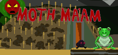
Moth Ma'am is a 2D pixel art platformer meant to eventually be beatable in a single sitting, like old Mega Man or Sonic games. Jump, flap, shoot, swim, air drill, and ride through 8 stages of cryptid mayhem. Try to earn a S rank on every stage.
$6.991 user reviews
ExplorationPrecision Platformer2D Platformer
Derek CrostonOct 21, 2025