Scoring genre clarity...
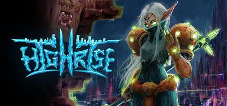
Highrise capsule

Highrise

Experience intense hack & slash combat in a fantastical, cyberpunk world for up to four players in online co-op. Choose your Renegade, take them into battle & customize your abilities, evolving into destructive new forms to tear down the Baron’s empire.

ActionLocal Co-Op4 Player Local
INTERLOCKETo be announced

Highrise scores 72/100 — better than 45% of Action capsules (n=8,838).

Released To be announced · By INTERLOCKE

Quick text summary

Highrise scored 72/100 on Steam Analyzer — Good for a Action capsule. Top priority fix: [uniqueness_polish] Introduce a distinctive mechanic visual or character silhouette element that signals what separates Highrise from other cyberpunk action games (e.g., visible form-shifting ability, faction badge, or unique armor aesthetic not seen in competing titles)

Capsule scores by dimension

  • Genre Clarity: 7/10 — Action cyberpunk hack-and-slash clear. The central character in heavy armor with glowing weapons and cyberpunk cityscape backdrop clearly communicates action-oriented gameplay in a sci-fi setting. At tiny size, the silhouette of the armored figure with prominent weapon elements and neon city environment still reads as action, though the specific hack-and-slash focus is less obvious. The palette and pose suggest combat-focused gameplay over exploration or strategy.
  • Title Readability: 8/10 — Neon title readable at all sizes. The "HIGHRISE" logo uses a bright cyan/teal glowing typeface with sharp angular letterforms that maintain excellent contrast against the dark background and remain legible even at tiny thumbnail size. The text placement in the upper left provides breathing room away from the character figure. At full header size it is crisp and striking; at small and tiny sizes the glow effect and weight preserve readability without collapse.
  • Contrast & Color: 8/10 — Strong neon separation dark background. The bright cyan title, golden-orange armor highlights, and character silhouette create sharp value separation against the dark teal-blue night sky and deep urban shadows. The glowing weapon effects and neon accents pop distinctly in a grayscale squint test, and the figure maintains clear silhouette definition. Colors are saturated but controlled, avoiding muddy midtones while the dark background ensures strong foreground separation.
  • Uniqueness & Polish: 7/10 — Stylish cyberpunk presentation competent. The capsule demonstrates solid craft with a distinctive cyberpunk aesthetic, neon typography, and dynamic character pose that conveys power and action. The armor design and glowing effects feel intentional rather than generic, and the composition suggests a premium production. However, the overall visual hook—while well-executed—aligns closely with established cyberpunk action game visual tropes and lacks a distinctive mechanical or narrative hook that would elevate it above peers like Armored Core VI or cyberpunk-themed competitors.
  • Brand Consistency: 6/10 — Consistent cyberpunk style limited icon. The neon cyan logo, dark urban environment, and armored character aesthetic form a coherent internal style across the capsule. The color palette and rendering are consistent throughout the visible elements. However, without clear access to other store assets, it is difficult to assess whether this establishes a memorable brand motif or unique character recognition cue; the cyberpunk soldier in heavy armor is a familiar archetype that could be from multiple games in the genre.
  • Composition: 7/10 — Clear hierarchy character focal point. The armored character is positioned as the strong primary focal point in the right-center area, while the glowing cyan title anchors the left side, creating good visual balance and depth layering with city background, character midground, and foreground weapon glow. At small and tiny sizes the figure maintains clear primacy without being obscured. The composition avoids clutter and uses safe margins well, though the right edge of the character silhouette sits slightly close to the frame edge on wider crops.

What works

  • Readable neon title at scale. The bright cyan "HIGHRISE" logo remains sharp and legible from full header down to tiny thumbnail sizes due to strong color contrast, weight, and strategic placement away from noisy background regions.
  • Strong dark-light contrast. Bright neon and golden armor elements create excellent value separation against deep shadows and dark teal sky, maintaining clear silhouette definition in grayscale and fast scroll scenarios.
  • Clear action focal point. The armored character pose and weapon readiness establish immediate genre clarity and dominant visual hierarchy at all sizes without competing elements stealing attention.

What hurts the capsule

  • Generic archetype lacking distinction. The heavy-armored cyberpunk soldier visual is a well-worn trope across the action genre and does not immediately signal what makes Highrise uniquely memorable compared to peers like Armored Core VI or Space Marine 2.
  • Limited brand identity cues. No clear iconic character, symbol, or signature visual motif appears that would be recognizable in future marketing or community discussions; the aesthetic is competent but interchangeable.
  • Right edge proximity risk. The character's weapon and right shoulder sit close to the frame edge, risking partial crop on certain Steam display contexts or aspect ratio variations.

Priority fixes

  1. [uniqueness_polish] Introduce a distinctive mechanic visual or character silhouette element that signals what separates Highrise from other cyberpunk action games (e.g., visible form-shifting ability, faction badge, or unique armor aesthetic not seen in competing titles)
  2. [brand_consistency] Develop a signature color accent or symbolic motif (beyond generic neon) that could become a recognizable brand marker across store assets and marketing materials
  3. [composition] Add safe margin padding to the right edge to ensure the character and weapon elements remain visible across all Steam display crops and aspect ratios

Store copy priority fixes

  1. [feature_communication] Restructure the detailed description into clear sections: Characters & Customization, Co-op Gameplay Loop, Environmental Mechanics, and the Music System. Under each, add 1-2 concrete sentences explaining what the player *does*, not just what exists (e.g., 'swap abilities between characters mid-mission to counter enemy types' instead of 'exchangeable abilities').
  2. [hook_strength] Rewrite the opening of the detailed description to lead with a hook that highlights the music system or environmental destruction angle: 'HIGHRISE is a 4-player co-op beat 'em up where every character plays a different instrument, and smashing the environment changes the battlefield itself.' This moves the unique selling point to the front.
  3. [tone_match] Fix all typos and capitalization errors (abitlies → abilities, remove random capital letters) to match the polished, energetic tone the copy is aiming for.
  4. [audience_targeting] Add a sentence clarifying solo play: either 'Fully playable solo with AI companions' or 'Designed for multiplayer—solo players seeking a challenge should look elsewhere' to set correct expectations early.

Related guides

Steam app ID: 3857230 · Tags: Action, Local Co-Op, 4 Player Local, Arcade, 3D