Scoring genre clarity...
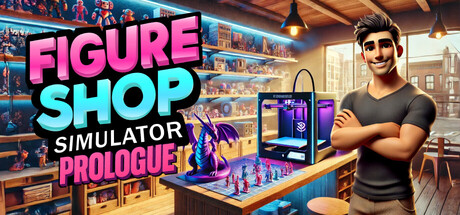
In this free version of the game, manage your own figure shop! Produce figures with 3D printers, stock your shelves, set prices, and offer the best shopping experience to your customers. Manage your warehouse, complete collections, follow trends, and grow your business!
Free to PlayVery Positive(98)
CasualSimulationEconomy
Gnome GamesJul 21, 2025