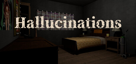
Quick text summary
Hallucinations scored 72/100 on Steam Analyzer — Good for a 3D capsule. Top priority fix: [uniqueness_polish] Introduce a distinctive visual element—such as a recurring geometric symbol, abstract visual distortion effect, or character silhouette—that appears in capsules and screenshots to signal brand identity.
Capsule scores by dimension
- Genre Clarity: 7/10 — Psychological mystery with clear setting. The interior room setting with minimal lighting and confined space signals a psychological/mystery adventure rather than action or puzzle. The sparse furniture and institutional quality suggest mental examination or containment, aligning with the hallucination premise. At tiny size, the room silhouette and lighting cues remain readable enough to imply psychological thriller rather than other adventure subgenres, though the exact nature is not immediately obvious.
- Title Readability: 8/10 — Large serif title reads clearly. The word 'Hallucinations' is rendered in large, cream-colored serif letters positioned across the upper-middle portion of the image with strong contrast against the dark background. The title maintains legibility at small and tiny sizes due to generous letter spacing and high value separation. Minor issue: no tagline or secondary text is visible, which is appropriate for a minimalist approach.
- Contrast & Color: 8/10 — Strong cream-to-dark separation. The cream-colored title pops distinctly against the dark room interior and black background, creating excellent value separation in both color and grayscale tests. The warm tan tones of the furniture provide mid-tone depth without mudding the foreground. Silhouettes of the room architecture remain clear and readable at all sizes, with no subject blending into background.
- Uniqueness & Polish: 7/10 — Cinematic minimalism, somewhat template-like. The capsule employs a strong cinematic approach with deliberate lighting and sparse composition that feels intentional rather than generic. However, the aesthetic—dark room with moody lighting and serif typography—shares visual DNA with other psychological indie titles, limiting distinctiveness. The execution is polished and clean, but lacks a memorable hook or signature visual element that would make it immediately recognizable outside context.
- Brand Consistency: 6/10 — Minimal branding, neutral presentation. The capsule relies on atmosphere and typography rather than distinctive character design, symbols, or recurring motifs that would signal brand identity. Without reference to the five store screenshots, the internal visual identity is coherent but generic—a cream serif typeface and darkly lit room could apply to many psychological adventure titles. Score remains at baseline competence; consistency exists but offers no memorable or iconic brand anchor.
- Composition: 7/10 — Centered title, clear focal hierarchy. The title occupies the prime horizontal center band of the composition, with the room providing atmospheric support below and around it. The bed and furniture in the background create visual depth without competing for attention, establishing a clear foreground-to-background hierarchy. At tiny size, the title remains the focal point, though the room detail becomes murky; safe margins are respected and the composition resists cropping issues well.
What works
- Excellent title contrast and legibility. Large cream serif letters with high value separation read clearly at full, small, and tiny sizes without loss of character definition.
- Strong atmospheric setup. The moody interior lighting and sparse furniture immediately establish a psychological, confined, introspective mood that aligns with the game's hallucination premise.
- Clean composition hierarchy. Title is clearly dominant with supporting room environment creating depth and context without visual clutter or competing focal points.
What hurts the capsule
- Generic psychological thriller aesthetic. The dark room and serif typography combination feels familiar in the indie adventure space and lacks a distinctive visual hook or signature element.
- Limited brand identity signals. No character, symbol, or unique motif is visible that would make this capsule recognizable as 'Hallucinations' specifically rather than a generic psychological game.
- Subtle room detail loss at tiny size. While the title remains readable, the architectural room elements and furniture become visually muddy at thumbnail scale, reducing atmospheric impact.
Priority fixes
- [uniqueness_polish] Introduce a distinctive visual element—such as a recurring geometric symbol, abstract visual distortion effect, or character silhouette—that appears in capsules and screenshots to signal brand identity.
- [genre_clarity] Add a subtle visual cue specific to the 'eighth day' or examination theme, such as a clock, calendar marking, or institutional detail that differentiates this from generic psychological games.
- [contrast_color] Consider introducing a secondary accent color (warm gold or cool unsaturated tone) in small areas to create visual interest while maintaining the dark, moody palette.
Store copy priority fixes
- [hook_strength] Rewrite the short description to open with an emotionally grounded hook: 'Every night, the room changes in subtle, disturbing ways. Are these hallucinations... or something worse?' This establishes both the mystery and dread immediately.
- [tone_match] Replace the FAQ format in the detailed description with narrative-driven prose that mirrors the game's psychological horror tone. Example: 'You wake in an unfamiliar room. Something feels wrong. By day eight, you'll know if your mind is betraying you.' Then explain mechanics naturally within that frame.
- [feature_communication] Add a dedicated paragraph early in the detailed description that articulates the emotional arc and what players are actually trying to understand or discover, not just the mechanical steps to take.
- [audience_targeting] Insert a sentence that explicitly signals who this is for: 'Ideal for fans of atmospheric horror and psychological mystery who prefer introspection over combat' or similar, to clarify the intended audience early.
Related guides
Steam app ID: 3859910 · Tags: 3D, First-Person, Adventure, Psychological Horror, Horror