Scoring genre clarity...

Victoriam capsule

Victoriam

GOLD, GLORY, GUTS! An auto battler roguelike where you construct your army from the finest soldiers and tear through your enemies in a never-ending war

$2.99
StrategySimulationCasual
Phillip HubbardOct 24, 2025

Victoriam scores 70/100 — better than 28% of Strategy capsules (n=5,103).

$2.99 · Released Oct 24, 2025 · By Phillip Hubbard

Quick text summary

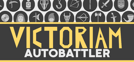
Victoriam scored 70/100 on Steam Analyzer — Good for a Strategy capsule. Top priority fix: [uniqueness_polish] Introduce a distinctive visual element such as a signature character unit, iconic army formation silhouette, or unique roguelike progression visual (e.g., ascending ranks, shield crest) that sets Victoriam apart from generic strategy games

Capsule scores by dimension

  • Genre Clarity: 7/10 — Strategy and combat clear. The row of military and fantasy iconography (soldiers, weapons, shields, crosses, crowns) at the top immediately signals strategy, warfare, and tactical gameplay. The 'AUTOBATTLER' subtitle explicitly confirms the auto-battler subgenre. At TINY size, the icon row becomes abstract shapes but still reads as militaristic/strategic due to the repeating circular badge format and weapon silhouettes, though some individual icons blur into ambiguity.
  • Title Readability: 8/10 — Title crisp and prominent. VICTORIAM in large, bold yellow-gold sans-serif and AUTOBATTLER in clean white below it sit on a strong dark gray band that isolates them from background noise. The contrast is excellent at full size and remains clear at SMALL size. At TINY size the text compresses but remains legible due to the high value separation and heavy font weight, though fine serifs would suffer.
  • Contrast & Color: 8/10 — Strong value separation achieved. Bright yellow-gold title pops sharply against the dark gray background and would stand out distinctly against Steam's #1b2838. The white subtitle adds secondary contrast without competing. The gray icon band at top provides enough visual separation from any background texture that might sit below. Grayscale test confirms clear light-dark separation across all key elements.
  • Uniqueness & Polish: 6/10 — Competent military theme. The icon row at top is a recognizable but somewhat generic military/fantasy visual motif—shields, swords, helmets, and crowns are common across strategy and war games and do not communicate a distinctive hook unique to Victoriam. The bold yellow typography is clean but conventional for gaming. No specific visual story, character, or signature mechanic emerges that differentiates this from other auto-battlers or tactics games.
  • Brand Consistency: 6/10 — Coherent but generic identity. The yellow-gold and dark gray palette is consistent and readable, and the military iconography reinforces the warfare theme throughout. However, there are no iconic characters, signature symbols, or memorable motifs that would make Victoriam instantly recognizable on sight—the design could belong to several strategy or war games. The heavy bold sans-serif is professional but not distinctive.
  • Composition: 7/10 — Balanced hierarchy, clear focus. The icon row anchors the top and draws the eye; the title band dominates the center with strong visual weight; supporting subtitle sits below in white. The layout is horizontally balanced with no dead space or awkward voids. At SMALL and TINY sizes the title remains the clear focal point. The icon row at top risks minor edge clipping on some displays but overall crop resilience is good because the title is safely centered.

What works

  • Title legibility at scale. Yellow-gold VICTORIAM and white AUTOBATTLER maintain clear readability from full header down to TINY thumbnail due to bold weight, high contrast, and isolation on dark gray band.
  • Military theme reinforcement. The repeating icon row (shields, swords, helmets, crowns, crosses) immediately signals strategy and warfare, aligning well with the auto-battler roguelike genre.
  • Strong color contrast. Warm yellow-gold and cool white against dark gray create visual pop and strong value separation that reads well against Steam's dark background.

What hurts the capsule

  • Generic military iconography. The icon set (swords, shields, helmets) are common across many strategy and war games and do not communicate a distinctive visual identity unique to Victoriam.
  • No character or signature motif. The capsule is purely typographic and icon-based with no focal character, unique mechanic visualization, or memorable brand symbol that would aid later recognition.
  • Limited visual storytelling. The design does not hint at the roguelike progression loop, army construction mechanic, or the 'GOLD, GLORY, GUTS' hook—it reads as a generic military strategy game.

Priority fixes

  1. [uniqueness_polish] Introduce a distinctive visual element such as a signature character unit, iconic army formation silhouette, or unique roguelike progression visual (e.g., ascending ranks, shield crest) that sets Victoriam apart from generic strategy games
  2. [brand_consistency] Develop a memorable brand motif or recurring symbol that could appear across marketing materials and be recognized as distinctly Victoriam (e.g., a custom insignia, unique color accent, or signature soldier pose)
  3. [composition] Consider adding a small focal illustration or character thumbnail in the lower right corner of the title band to break the purely typographic layout and add visual interest without cluttering TINY sizes

Store copy priority fixes

  1. [uniqueness] Add a sentence after the short description explaining one specific mechanic or theme that differentiates Victoriam from other auto battlers (e.g., 'Position matters more than in X' or 'Dark fantasy aesthetic sets tone for unit synergies').
  2. [feature_communication] Expand the UPGRADES and WAGE WAR sections to explain how positioning interacts with unit types and what strategic decisions matter most in combat.
  3. [tone_match] Infuse the detailed description with dark fantasy voice—replace clinical language with evocative phrases that reflect the thematic setting and reinforce atmosphere.
  4. [audience_targeting] Add a closing line that clarifies the intended player: 'For fans of tactical roguelikes who enjoy strategic army building' or similar.

Related guides

  • Steam page optimisationCapsule, copy, screenshots, tags — the full Steam page conversion stack.
  • Steam tags guideTag selection, ordering, and how it shapes Steam's recommendation rails.

Steam app ID: 3860340 · Tags: Strategy, Simulation, Casual, Auto Battler, Roguelike