Scoring genre clarity...
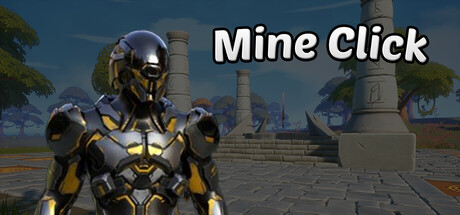
MINE CLICK Mine, upgrade, dominate - every click counts! Dive into a fast-paced 3D clicker game set in a wild, post-apocalyptic swamp. Mine valuable resources, upgrade your power, and battle enemies in intense click duels to steal their loot. Can you survive the swamp - one click at a time?
$1.994 user reviews
AdventureCasualAction-Adventure
StartPlayJul 25, 2025