Scoring genre clarity...
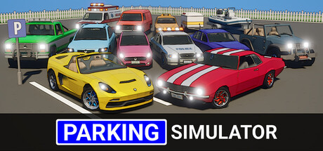
Master the art of parking! Enjoy 100 handcrafted levels with 10 vehicles, 3 trailers, and accurate collisions. No time limits, no traffic — just pure parking precision. Unlock cars, test your skills in mini-games, and relax your way to parking perfection.
$7.99Positive(15)
DrivingAutomobile SimSimulation
Perseverance GamesNov 3, 2025