Scoring genre clarity...
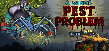
In "A Minor Pest Problem," Pilot a heavily armed truck through environments in this 2D top-down shooter. Prove that no problem is too big for a trucker with enough firepower. Drive, shoot, survive, and show the wilderness what a real pest looks like.
$4.99No user reviews
ActionTop-Down ShooterShooter
SN PixelWorksAug 12, 2025