Scoring genre clarity...
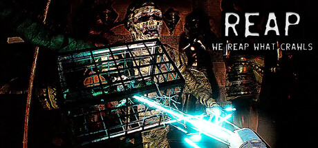
Capture monsters and throw physics objects in shifting dungeons! Farm, feed, sacrifice, and sell them from your basement. 1-4 players horror dungeon crawling X creature collection & farming! R.E.P.O. meets Slime Rancher / Horror Pokémon!
$4.991 user reviews
Dungeon CrawlerCreature CollectorOnline Co-Op
Tbjbu2Mar 13, 2026