Scoring genre clarity...

Mate'Morphosis capsule

Mate'Morphosis

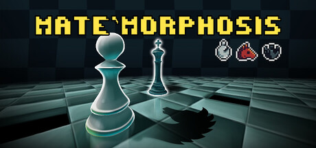
Mate'Morphosis is a pixel art, chess-inspired puzzle game built around the concept of becoming the piece you capture. Outsmart each board, adapt to evolving mechanics, and hunt down the rival king across every stage.

$2.09Positive(46)
IndiePuzzleLogic
WiseMonkeES, Bruder StudioJan 9, 2026

Mate'Morphosis scores 73/100 — better than 57% of Indie capsules (n=11,449).

Positive (46 reviews) · $2.09 · Released Jan 9, 2026 · By WiseMonkeES

Quick text summary

Mate'Morphosis scored 73/100 on Steam Analyzer — Good for a Indie capsule. Top priority fix: [genre_clarity] Integrate a visual hint of the 'transformation' or 'morphing' mechanic—such as a pawn mid-transition into another piece or a silhouette split effect—to differentiate from generic chess templates.

Capsule scores by dimension

  • Genre Clarity: 7/10 — Chess puzzle game evident. The prominent chess pieces (pawn, king) and grid board immediately signal strategy and puzzle gameplay. At TINY size, the chess iconography remains recognizable, though the pixel art nature and transformation mechanic are not visually obvious. The aesthetic reads as cerebral puzzle game rather than action, which is appropriate for the genre.
  • Title Readability: 8/10 — Bold yellow title, clear at all sizes. MATE MORPHOSIS in solid yellow caps sits at the top with strong contrast against the dark background. At SMALL and TINY sizes, the letterforms remain legible and don't collapse. The spacing is clean and the weight is substantial enough to survive compression, though at TINY the letter definition softens slightly but stays readable.
  • Contrast & Color: 8/10 — Strong light-dark separation throughout. Yellow title pops decisively against dark teal-blue gradient background. The chess pieces use white and metallic highlights that create clear silhouettes against the board's darker grid. In grayscale, the value separation remains strong, and the cyan glow beneath elements adds visual depth. At TINY size, the bright pieces maintain their separation from background.
  • Uniqueness & Polish: 7/10 — Polished chess aesthetic, modest distinction. The 3D rendered chess pieces and geometric grid create a clean, professional look that feels intentional. However, the chess-on-grid visual is a familiar template in puzzle game marketing. The five small icons at top-right (suggesting capture mechanics or special pieces) add a hint of unique gameplay but read as decoration rather than a bold selling point. The overall craft is solid but doesn't stand out dramatically against peers like Balatro or DAVE THE DIVER.
  • Brand Consistency: 6/10 — Standard chess branding, limited identity. The chess piece motif and geometric grid are thematically appropriate but generic across many strategy games. There are no distinctive color signatures, character icons, or visual motifs that would make this immediately recognizable as Mate'Morphosis on repeated viewing. The tone is corporate-clean rather than indie-personality, which may not differentiate it in a crowded casual strategy space.
  • Composition: 8/10 — Clear hierarchy, balanced layout. The composition uses a strong top-to-bottom flow: title at top, central chess pieces as focal point, and secondary icons clustered on the right. The pawn and king occupy the center with good depth from the grid plane, creating clear foreground-midground-background separation. At SMALL size, the layout holds well; at TINY, the pieces remain visually dominant and the title stays legible without competition. Safe margins appear respected, though the right-side icons cluster slightly tight.

What works

  • Instant genre recognition. Chess pieces and grid board immediately communicate strategy puzzle gameplay without ambiguity.
  • Readable title at all sizes. Bright yellow caps maintain legibility from full size down to TINY without collapse or blur issues.
  • Strong value contrast. Bright pieces and yellow text separate decisively from dark background, holding clarity in grayscale and at quick glance.
  • Professional visual polish. 3D rendering quality and clean geometric design feel intentional and competent, avoiding cheap or template asset appearance.

What hurts the capsule

  • Generic chess template. The chess-on-board concept is visually familiar across puzzle games and does not communicate the unique 'become the piece you capture' mechanic.
  • Right-side icons lack clarity. The five small game mechanic icons at top-right are difficult to parse at SMALL and TINY sizes and feel decorative rather than communicating core gameplay.
  • Limited brand identity. No distinctive color palette, character icon, or visual motif that would make this recognizable as Mate'Morphosis specifically rather than a generic strategy game.
  • Weak unique selling point. The transformation mechanic and adaptive mechanics unique to the game are not visually hinted at; it could be any chess puzzle game.

Priority fixes

  1. [genre_clarity] Integrate a visual hint of the 'transformation' or 'morphing' mechanic—such as a pawn mid-transition into another piece or a silhouette split effect—to differentiate from generic chess templates.
  2. [uniqueness_polish] Develop a distinctive color signature or icon motif (e.g., a glowing morph aura, branded symbol) that appears consistently and hints at the core adaptive gameplay loop.
  3. [composition] Simplify or consolidate the top-right icon cluster into a clearer secondary visual or remove entirely to reduce visual noise and improve clarity at TINY size.
  4. [brand_consistency] Add a recognizable character, mascot, or visual signature element that could be featured across future store assets for stronger brand recall.

Store copy priority fixes

  1. [hook_strength] Rewrite the detailed description opening to match the clarity of the short description: replace "navigating ONE PIECE to capture queen" with something like "Transform your piece with every capture—each enemy you defeat changes how you move, forcing you to plan sequences and adapt tactics."
  2. [feature_communication] Expand or complete the "Play your way" bullet point with a concrete example (e.g., "Multiple solutions—find your own path to victory with branching routes and varied move sequences") or remove it entirely.
  3. [tone_match] Remove or significantly rework the "Once Wise Monke Said" section and replace it with a substantive gameplay benefit statement that reinforces the strategic, puzzle-focused identity (e.g., a statement about learning curve or challenge progression).
  4. [uniqueness] Add 1-2 sentences explaining the *consequence* of morphing mechanics on puzzle design (e.g., "Each transformation opens new board routes and locks others, creating dynamic spatial puzzles that evolve in real time").

Related guides

Steam app ID: 3863030 · Tags: Indie, Puzzle, Logic, Chess, Difficult