Scoring genre clarity...
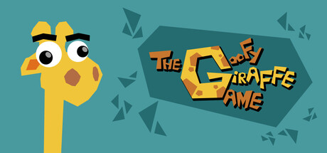
The Goofy Giraffe Game is a 3D platformer in which you play Softy, a giraffe locked in a child's bedroom ruled by the terrifying Cube Rouge King. Find your spots and jump higher and higher, breaking your neck to escape from this room !
$2.99Positive(15)
ExplorationActionPrecision Platformer
Team BrakacéeNov 12, 2025