Scoring genre clarity...
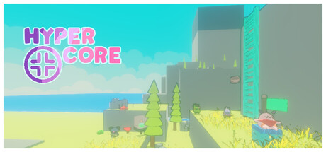
Hypercore is a Party Platformer made both with and without multiplayer in mind. Over 1 Billion runs possible with up to 4 players locally. Use Numerous Items against dangerous enemies, scale Golden Cliffs and Barren Landscapes and do what is considered impossible.
$4.994 user reviews
RacingAction Roguelike3D Platformer
HyperforgAug 6, 2025