Scoring genre clarity...

TavernHold capsule

TavernHold

Build, manage and defend your fantasy tavern.

$6.99Mostly Positive(25)
Resource ManagementTower DefenseBase Building
Tevniyal StudiosJan 9, 2026

TavernHold scores 80/100 — better than 88% of Resource Management capsules (n=1,726).

Mostly Positive (25 reviews) · $6.99 · Released Jan 9, 2026 · By Tevniyal Studios

Quick text summary

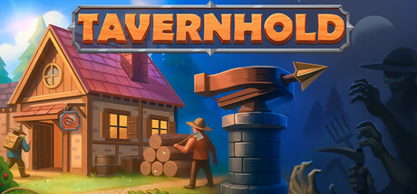
TavernHold scored 80/100 on Steam Analyzer — Good for a Resource Management capsule. Top priority fix: [uniqueness_polish] Introduce a signature visual motif or distinctive art style element (e.g., unique architectural detail, iconic character design, or thematic symbol) that differentiates TavernHold from generic fantasy tavern aesthetics and increases visual memorability.

Capsule scores by dimension

  • Genre Clarity: 8/10 — Clear fantasy tavern management visuals. The capsule immediately communicates a fantasy tavern-building game through the prominent wooden tavern structure on the left, the character figure in work pose, and defensive tower element on the right. At TINY size, the silhouette of the building and tower remain readable, clearly signaling a management and defense hybrid. The warm fantasy aesthetic and construction/defense imagery align well with the stated 'build, manage and defend' core loop.
  • Title Readability: 9/10 — Bold, high-contrast readable title. TAVERNHOLD uses a thick, uppercase orange/yellow sans-serif font on a solid dark blue band that runs horizontally across the upper portion. The title maintains excellent contrast and letterform clarity at both FULL and TINY sizes, with strategic placement on a solid background rather than busy texture. Even in a squint test and at extreme reduction, the text remains distinguishable as a game title.
  • Contrast & Color: 9/10 — Strong value separation and vibrant palette. The capsule uses a warm/cool split: golden-orange tavern building and title text pop brightly against a deep blue sky gradient background, creating strong value separation that persists in grayscale. The character figure and tower silhouettes have clean edges and read clearly even at TINY size against the darker blue zones. Saturation is well-controlled, with the orange and warm yellows feeling saturated without becoming harsh.
  • Uniqueness & Polish: 7/10 — Polished but somewhat familiar fantasy aesthetic. The visual execution is clean and professional with smooth gradients, well-rendered architectural elements, and a cohesive illustrative style. However, the fantasy tavern + tower defense formula and warm wooden building aesthetic are somewhat familiar within the indie management game space; it reads as competent and intentional but does not introduce a distinctive visual hook or unique art direction that immediately separates it from other cozy management titles. The composition and craft are solid, keeping it in the good range without premium standout.
  • Brand Consistency: 7/10 — Consistent fantasy tavern visual identity. The capsule establishes a clear visual identity around medieval fantasy tavern architecture, warm candlelight interiors, and rustic construction elements. The color palette (warm golds, deep blues, wood tones) and architectural style are internally cohesive and suggest a recognizable brand. Without access to the 7 store screenshots, consistency cannot be fully verified, but the capsule itself presents a unified art direction that appears sustainable across marketing materials.
  • Composition: 8/10 — Strong focal hierarchy with balanced layout. The tavern building sits in the left-center as the primary focal point, drawing the eye naturally, while the tower defense element on the right creates secondary interest without competing. The title banner anchors the top, and the character figure bridges left and right zones, creating depth and preventing static composition. At TINY size, the primary subject (the tavern structure) remains the dominant read, and no critical elements are uncomfortably close to edges that would be cropped by Steam's display.

What works

  • Excellent title contrast and placement. The orange TAVERNHOLD text on solid dark blue background maintains perfect readability across all viewing sizes and remains legible even when squinted.
  • Strong value separation and silhouettes. Warm tavern and tower elements pop cleanly against the cool blue gradient, ensuring the game remains visually distinct and readable in quick scroll contexts.
  • Clear genre and mechanic communication. Building, managing, and defending are all visually represented through the tavern structure, character, and tower, immediately conveying the core gameplay loop without ambiguity.
  • Balanced focal hierarchy. The tavern commands attention as primary subject while supporting elements guide the eye naturally, avoiding scattered composition at both FULL and TINY scales.

What hurts the capsule

  • Familiar fantasy aesthetic without unique hook. The warm wooden tavern + tower defense visual formula is competent but not visually distinctive within the crowded indie management game space.
  • Limited storytelling or character personality. The human figure and tavern are functional and clear, but lack specific character traits or narrative tension that would elevate uniqueness and memorable brand identity.

Priority fixes

  1. [uniqueness_polish] Introduce a signature visual motif or distinctive art style element (e.g., unique architectural detail, iconic character design, or thematic symbol) that differentiates TavernHold from generic fantasy tavern aesthetics and increases visual memorability.
  2. [brand_consistency] Add a subtle, iconic symbol, emblem, or color accent that serves as a recurring brand signature across all marketing materials to strengthen instant recognition.

Store copy priority fixes

  1. [hook_strength] Rewrite the short description to lead with the core tension—e.g., 'By day, run a profitable tavern. By night, defend it from the undead or lose everything.' This adds urgency and emotional stakes.
  2. [uniqueness] Add 1–2 sentences explicitly contrasting TavernHold from standard tower defense or management games—e.g., highlight how daily random bonuses force mid-run pivots or how ballista control creates a hybrid skill element.
  3. [tone_match] Inject subtle thematic voice (tavern keeper perspective, medieval flavor) into 2–3 key sentences to differentiate the writing from generic tower defense copy and make it feel authored for this specific game.
  4. [audience_targeting] Clarify in the opening paragraph whether this is for strategy veterans seeking optimization challenges or casual players wanting relaxing resource-gathering loops, or both.

Related guides

Steam app ID: 3863310 · Tags: Resource Management, Tower Defense, Base Building, Roguelite, Management