Scoring genre clarity...

Tales of Terrarum capsule

Tales of Terrarum

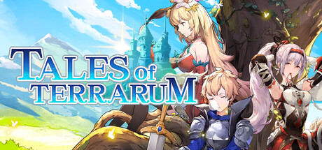
《Tales of Terrarum》is a management adventure sim game. On the new land of Terrarum, you will inherit a territory as a descendant of the Francz family, and become the town mayor to settle the craftsmen and adventurers who come to the town. You'll live in and expand the town together.

Free to PlayVery Positive(23)
Free to PlayRPGCasual
Electronic SoulApr 27, 2026

Tales of Terrarum scores 73/100 — better than 62% of Free to Play capsules (n=2,194).

Very Positive (23 reviews) · Free to Play · Released Apr 27, 2026 · By Electronic Soul

Quick text summary

Tales of Terrarum scored 73/100 on Steam Analyzer — Good for a Free to Play capsule. Top priority fix: [composition] Shift character group slightly left and ensure all four characters remain in safe margin area, minimum 20px from edges, to guarantee clean display across Steam's varied crop contexts.

Capsule scores by dimension

  • Genre Clarity: 7/10 — Clear management sim with RPG elements. The capsule clearly communicates a casual management/town-building game through the settlement scene, diverse character roster, and bright pastoral landscape with infrastructure hints. At tiny size, the characters and bright outdoor setting still read as a management adventure rather than pure combat RPG, though the genre blend could be slightly clearer with more explicit UI or building iconography.
  • Title Readability: 8/10 — Strong legible title with good outline. The 'TALES of TERRARUM' title uses white letters with a dark blue/navy outline that maintains excellent contrast against the sky background at all sizes. The text remains readable even at tiny size due to clear letterforms and strategic placement in the upper-left quadrant on a relatively uncluttered sky region rather than character silhouettes.
  • Contrast & Color: 8/10 — Excellent value separation and silhouettes. The bright blue sky, green landscape, and warm-toned characters create strong value separation that reads clearly at small sizes against the dark Steam background. Character silhouettes pop distinctly from background elements, and the golden/warm tones of armor and clothing provide natural visual hierarchy without muddy mid-tones; grayscale squint test shows clean foreground-to-background separation.
  • Uniqueness & Polish: 7/10 — Polished anime style with solid craft. The capsule demonstrates professional anime illustration work with clean character rendering, cohesive color palette, and intentional composition that communicates the town-building fantasy concept. However, the visual approach feels competent rather than distinctive within the cozy management sim genre—the anime characters and pastoral setting are expected touchstones for games like Moonstone Island or Snufkin, lacking a truly unique hook beyond solid execution.
  • Brand Consistency: 7/10 — Recognizable character roster and palette. The capsule establishes a consistent anime art direction with a warm, earthy color palette (golden yellows, soft purples, natural greens) and features a diverse ensemble cast that suggests narrative breadth. The consistent rendering style and character proportions signal a coherent brand identity, though without access to other assets, the depth of recurring visual motifs or iconic symbols remains moderately strong rather than exceptional.
  • Composition: 7/10 — Clear hierarchy with minor framing issues. The composition uses strong foreground-to-background layering with the character group as the clear primary focal point, anchored by the title in the upper region and supported by the expansive landscape. At tiny size the composition reads well, though the right-edge character placement sits close to potential crop boundaries and the sky-dominated upper third, while functional, creates slightly wasted prime real estate that could strengthen focal point dominance.

What works

  • High-contrast readable title. White text with dark outline maintains legibility across all viewing sizes and pops cleanly against sky background without requiring fine detail parsing.
  • Distinct character ensemble establishes identity. The diverse cast of four characters with varied designs and color schemes creates visual interest and communicates the management sim's focus on NPCs and relationships.
  • Professional illustration and color control. Warm, cohesive palette and clean rendering avoid muddy transitions; natural lighting and golden tones create premium feel appropriate for a polished indie title.
  • Clear genre-appropriate setting. Pastoral landscape with settlement elements (grass, slopes, infrastructure hints) immediately communicates the town-building/management adventure context.

What hurts the capsule

  • Generic anime style lacks visual distinction. While well-executed, the anime character illustration approach is a familiar touchstone in cozy management games; the capsule reads competently but doesn't stand out from genre peers like Moonstone Island or similar titles.
  • Right-edge character placement risks cropping. The rightmost character (purple-haired figure) sits near the edge and may be partially cut off depending on Steam's capsule crop behavior, reducing composition stability.
  • Sky-heavy composition wastes prime real estate. The upper third is dominated by bright sky with minimal visual information, creating a vertical imbalance that could be better utilized for title emphasis or additional focal depth.

Priority fixes

  1. [composition] Shift character group slightly left and ensure all four characters remain in safe margin area, minimum 20px from edges, to guarantee clean display across Steam's varied crop contexts.
  2. [uniqueness_polish] Introduce a signature visual element—unique UI styling, memorable architecture detail, or character motif—that differentiates Tales of Terrarum from competing cozy management sims and creates lasting brand recall.
  3. [composition] Reduce sky area by repositioning horizon line lower or introducing foreground settlement elements (buildings, roads, crafting stations) to strengthen the town-building gameplay hook and increase focal depth.

Store copy priority fixes

  1. [feature_communication] Remove the windowed mode technical guide from the detailed description and move it to a separate FAQ or community section—it occupies critical space needed for gameplay storytelling and feels like a support document rather than marketing copy.
  2. [hook_strength] Rewrite the short description's opening to lead with emotional stakes: 'Restore a forgotten town to glory as its new mayor—build thriving trade networks, discover lost treasures, and welcome colorful craftspeople to create something uniquely yours.'
  3. [uniqueness] Add a concrete differentiation statement such as 'With hundreds of uniquely skilled NPCs, interlocking production chains, and real-time town progression, Terrarum offers deeper settlement management than traditional farming sims' or call out a specific hybrid mechanic that competitors lack.
  4. [feature_communication] Expand each feature bullet from one line to two sentences with at least one concrete example: e.g., 'Build production chains from forestry to finished goods. Establish a lumber mill → workshop → trade post to generate income and satisfy settlement needs.'

Related guides

Steam app ID: 3864100 · Tags: Free to Play, RPG, Casual, Simulation, Farming Sim