Scoring genre clarity...
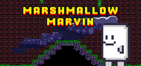
Marshmallow Marvin is a challenging 2D pixel art platformer where you guide Marvin through trap filled catacombs, avoiding deadly spikes, dodging automated turrets, and mastering precision platforming to reach the exit.
$4.99No user reviews
ActionAdventureCasual
Jolly Lobster Interactive LTDApr 7, 2026