Scoring genre clarity...
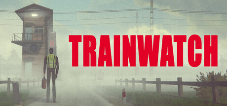
Trainwatch capsule

Trainwatch

Meet Troy, the new Gatekeeper. His job is simple - close the gates at a desolate railway crossing for one month. This is his last chance to earn back his wife's trust. To prove he can stay sober. To become a better man. Join him at the Tower in the middle of nowhere. Help Troy fix his life.

AdventureAction-AdventureLife Sim
Harvester Games2026

Trainwatch scores 67/100 — better than 17% of Adventure capsules (n=8,231).

Released 2026 · By Harvester Games

Quick text summary

Trainwatch scored 67/100 on Steam Analyzer — Solid for a Adventure capsule. Top priority fix: [genre_clarity] Add a small human silhouette or character element (Troy) to communicate the narrative-driven walking simulator or adventure game structure and emotional core.

Capsule scores by dimension

  • Genre Clarity: 7/10 — Railway setting clear, genre mixed. The industrial railway crossing, gatehouse tower, and desolate landscape immediately signal a railway/transportation theme with atmospheric indie vibes. However, at tiny size the narrative-driven character drama aspect is lost—it reads as adventure or simulation rather than a poignant narrative game about redemption. The visual language leans toward atmospheric indie but doesn't strongly communicate the core walking simulator or narrative game structure.
  • Title Readability: 8/10 — Bold title, strong visibility. TRAINWATCH is rendered in large, bold red sans-serif capitals with a clear outline, positioned at top center over a softer background. At small and tiny sizes the letterforms remain legible and the red pops against the muted sky gradient, though the thick bold treatment is somewhat generic. The title does not collapse at any viewing size and maintains clear separation from the landscape.
  • Contrast & Color: 7/10 — Strong red-sky separation. The bright saturated red title contrasts well against the pale blue-gray sky, creating clear value separation that works at all sizes. The dark silhouette of the gatehouse and industrial structures provide mid-tone contrast in the composition. However, the overall palette is cool and muted except for the title, which means the capsule lacks visual warmth and the supporting elements blend somewhat into the overcast background at tiny size.
  • Uniqueness & Polish: 6/10 — Competent but thematically generic. The image captures an authentic desolate railway crossing with soft environmental lighting and realistic atmospheric perspective, showing craft in photography or rendering quality. However, the composition—industrial landscape with mist and gatehouse—reads as a literal interpretation of the setting rather than a distinctive visual hook that conveys the emotional narrative of redemption or sobriety. Compared to top performers like DREDGE or Jusant, it lacks a memorable stylistic signature or thematic visual metaphor.
  • Brand Consistency: 5/10 — Realistic but not iconic. The capsule presents a photorealistic or realistic-render aesthetic with muted earth tones, pale sky, and industrial subject matter. Without access to additional store screenshots, the image does not display obvious recurring brand motifs, color palettes, or character iconography that would signal strong internal consistency. The style is grounded and thematically appropriate but lacks a distinctive visual identity that would make the game immediately recognizable.
  • Composition: 7/10 — Clear focal point, good layering. The composition uses strong depth layering with foreground railway tracks, midground gatehouse tower with red light, and soft background industrial buildings and sky. The title anchors the top and the central gatehouse structure serves as a clear focal point that draws the eye. At small and tiny sizes the focal point remains readable and the composition does not feel cluttered, though the broad empty sky occupies significant real estate without adding narrative content.

What works

  • Bold title legibility. Large red sans-serif capitals maintain clear readability even at tiny thumbnail size with strong contrast against the pale sky.
  • Clear atmospheric focal point. The gatehouse tower with its red signal light serves as a strong central anchor that guides attention and reinforces the railway setting.
  • Depth and layering. Foreground tracks, midground tower, and background industrial structures create visual hierarchy and a sense of place without clutter.

What hurts the capsule

  • Generic industrial aesthetic. The realistic landscape composition, while authentic, reads as a literal scene rather than a distinctive visual brand or thematic hook that communicates the game's emotional core.
  • Muted palette with limited warmth. The cool gray-blue tones and overcast lighting limit visual impact at small sizes; supporting elements blend into the background rather than creating separation.
  • No character or narrative visual cue. The capsule does not feature Troy or any human presence, missing an opportunity to communicate the character-driven redemption narrative that differentiates this game.

Priority fixes

  1. [genre_clarity] Add a small human silhouette or character element (Troy) to communicate the narrative-driven walking simulator or adventure game structure and emotional core.
  2. [uniqueness_polish] Introduce a distinctive color accent or visual motif beyond the title red that signals the game's thematic focus on sobriety, redemption, or personal struggle—such as a symbolic object or warm lighting contrast.
  3. [contrast_color] Increase overall warmth or add a secondary accent color to break up the cool muted palette and improve visual distinction at small sizes.
  4. [brand_consistency] Ensure consistent application of any new visual identity elements across store screenshots to build recognizable brand signature.

Related guides

Steam app ID: 3864940 · Tags: Adventure, Action-Adventure, Life Sim, Exploration, Simulation