Scoring genre clarity...

The Amusement capsule

The Amusement

An abandoned amusement park, a tangled memory, a family shattered by the Great War… Discover an intense story in this redirected-walking VR adventure in which every step counts.

$21.99Positive(35)
VRAdventurePuzzle
Curvature Games, ARTE FranceApr 16, 2026

The Amusement scores 75/100 — better than 65% of VR capsules (n=436).

Positive (35 reviews) · $21.99 · Released Apr 16, 2026 · By Curvature Games

Quick text summary

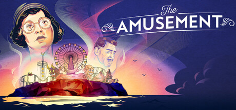
The Amusement scored 75/100 on Steam Analyzer — Good for a VR capsule. Top priority fix: [composition] Strengthen focal hierarchy by slightly darkening the secondary character on the right to make the left-center figure the unambiguous primary anchor across all sizes.

Capsule scores by dimension

  • Genre Clarity: 7/10 — Adventure narrative with atmospheric setting. The abandoned amusement park with vintage fairground elements (Ferris wheel, carnival structures) and melancholic color palette clearly signal a story-driven adventure game with dark themes. The silhouetted figures and war-era visual language hint at historical narrative depth. At TINY size, the iconic Ferris wheel and warm-to-cool gradient fade remain recognizable, though specific genre cues become less distinct.
  • Title Readability: 8/10 — Clean, centered title with strong hierarchy. The title 'The AMUSEMENT' uses a serif font with decorative flourishes that maintains good legibility at full size and remains readable at SMALL size thanks to its centered placement and high contrast against the gradient. At TINY size, 'AMUSEMENT' is still parseable due to its larger scale and distinct letterforms, though decorative elements compress slightly. The 'The' prefix is elegantly sized appropriately below the main word.
  • Contrast & Color: 8/10 — Strong warm-cool gradient with clear silhouettes. The capsule uses a compelling gradient from warm orange-yellow in the lower third to cool pink-purple in the upper regions, creating excellent value separation against the Steam dark background #1b2838. Character faces are rendered in lighter tones that pop clearly; the Ferris wheel silhouette is dark and distinct. At TINY size, the warm-cool color transition remains the primary visual hook, and contrast holds well in grayscale.
  • Uniqueness & Polish: 8/10 — Distinctive art style with thematic cohesion. The capsule features hand-illustrated character faces with period-appropriate styling, warmer color grading, and integrated carnival iconography that avoids generic adventure cliché. The composition tells a visual story—fractured family and lost history—rather than just depicting a pretty scene. The production quality compares favorably to reference titles like Chants of Sennaar and Harold Halibut, with intentional color and tone choices.
  • Brand Consistency: 7/10 — Cohesive vintage aesthetic with character focus. The capsule establishes a recognizable identity through its vintage illustration style, warm-cool color palette, and focus on human faces set against historical disaster imagery. The serif typography and art deco-inspired flourishes around the title reinforce a period-specific brand voice. Without seeing all 16 screenshots, the warm color grading and character-centric composition appear consistent with a narrative-driven adventure that emphasizes emotional storytelling.
  • Composition: 7/10 — Layered depth with clear focal points. The composition uses three distinct planes: foreground characters (left and center-right), midground carnival structures and Ferris wheel, and background sky gradient. The character on the left anchors attention, while the Ferris wheel provides iconic secondary interest. At SMALL size, the hierarchy reads well; at TINY size, the silhouetted carnival against the gradient remains the primary focal point. Title placement above the center is safe and does not interfere with critical imagery.

What works

  • Striking color gradient creates visual momentum. The warm-to-cool gradient from golden tones to pink-purple creates compelling mood and strong contrast separation against Steam's dark background, making the capsule memorable even in quick scroll.
  • Character illustration draws emotional connection. The rendered faces with period styling and vulnerable expressions signal narrative depth and human stakes, differentiating the game from generic adventure titles.
  • Title legibility maintained across all sizes. Centered, hierarchical typography with clean letterforms and appropriate spacing ensures 'The AMUSEMENT' reads clearly at FULL, SMALL, and TINY viewing scales.
  • Iconic Ferris wheel provides instant thematic anchor. The abandoned carnival structure is instantly recognizable and reinforces the core setting without requiring text explanation.

What hurts the capsule

  • Decorative title flourishes risk compression at tiny size. The ornamental swirls around 'AMUSEMENT' add elegance but may become visual noise when the capsule is viewed at minimal scale, slightly reducing impact.
  • Right side composition feels slightly top-heavy. The secondary character on the right and cloud elements at top occupy similar visual weight to the lower carnival, creating some compositional imbalance that could be tightened.
  • Limited background detail in lower third. The solid dark water-like base below the carnival structures offers less environmental storytelling than the richly detailed upper zones, leaving some compositional real estate underutilized.

Priority fixes

  1. [composition] Strengthen focal hierarchy by slightly darkening the secondary character on the right to make the left-center figure the unambiguous primary anchor across all sizes.
  2. [contrast_color] Increase saturation of the Ferris wheel silhouette or add a subtle glow to ensure it remains visually distinct at TINY size without losing definition.
  3. [uniqueness_polish] Add subtle texture or environmental details to the foreground base to increase visual richness and reduce the sense of an empty void at bottom.

Store copy priority fixes

  1. [feature_communication] Add 1–2 concrete puzzle examples (e.g., 'reconstruct a music box mechanism' or 'navigate a hall of mirrors') to replace vague 'holistic thinking' language and help players visualize actual gameplay.
  2. [uniqueness] Expand on Samantha's agency in the narrative—does the player's exploration alter her memory recall or story outcome? Clarify what makes this story-driven experience distinct beyond the setting.
  3. [hook_strength] Consolidate the redirected-walking explanation into one detailed paragraph in the opening rather than repeating it four times; use freed space to deepen the emotional hook about family memory.
  4. [audience_targeting] Add a single sentence specifying target experience level (casual puzzle solvers, narrative-focused players, etc.) and approximate play duration to help players self-identify as the audience.

Related guides

Steam app ID: 3867610 · Tags: VR, Adventure, Puzzle, Exploration, Mystery